
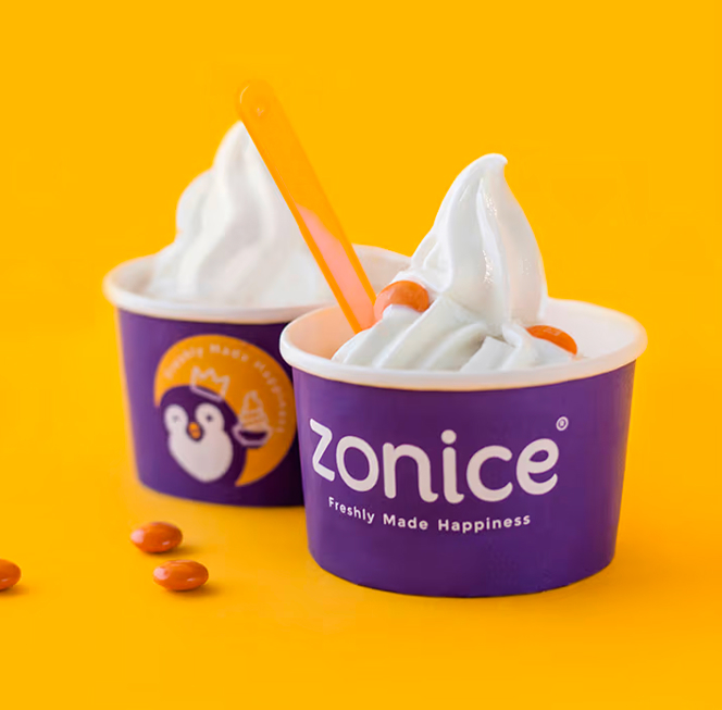
The sweetest frozen yogurt café chain in Saudi Arabia.


%20(1).gif)
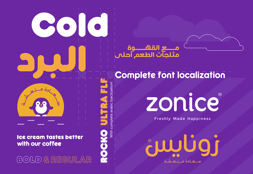
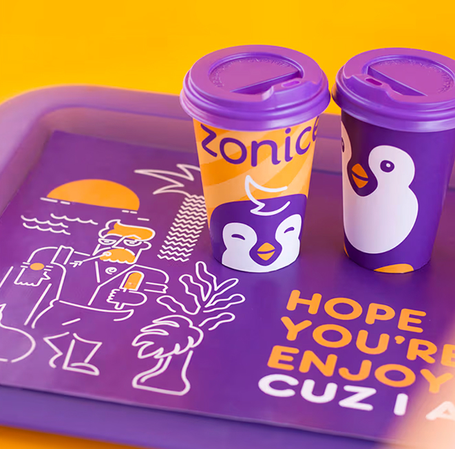
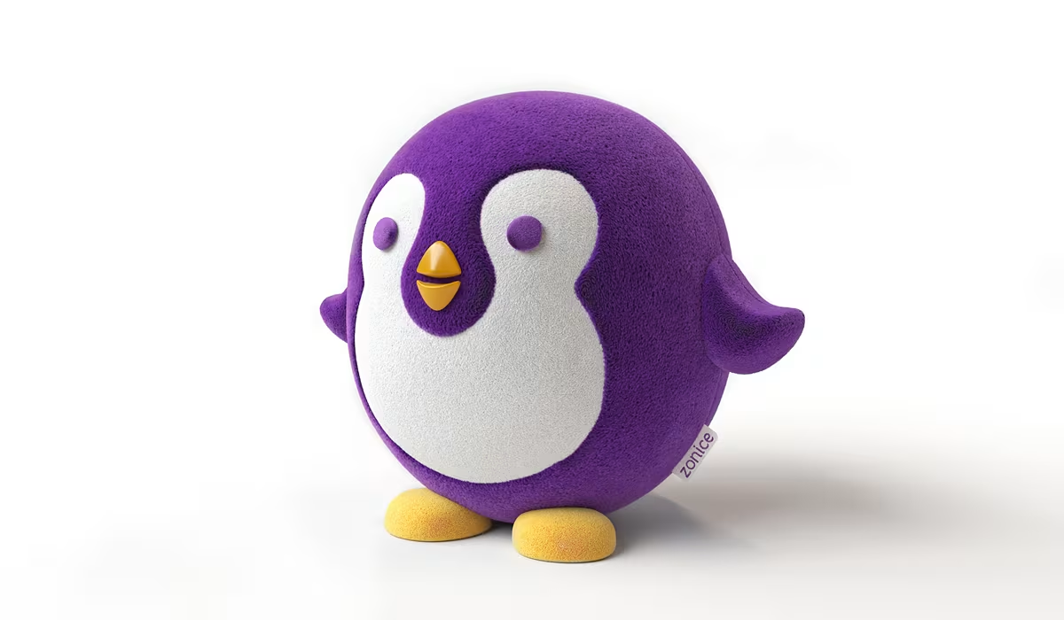
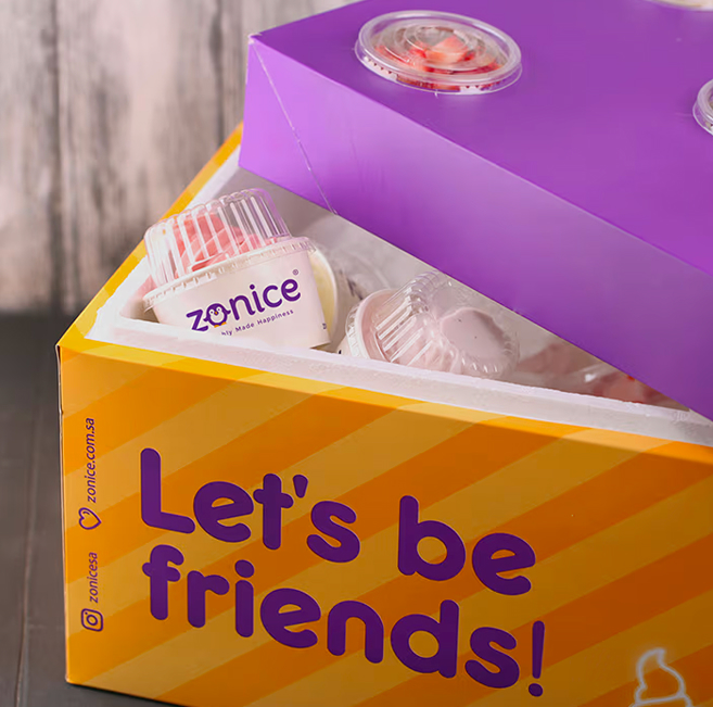
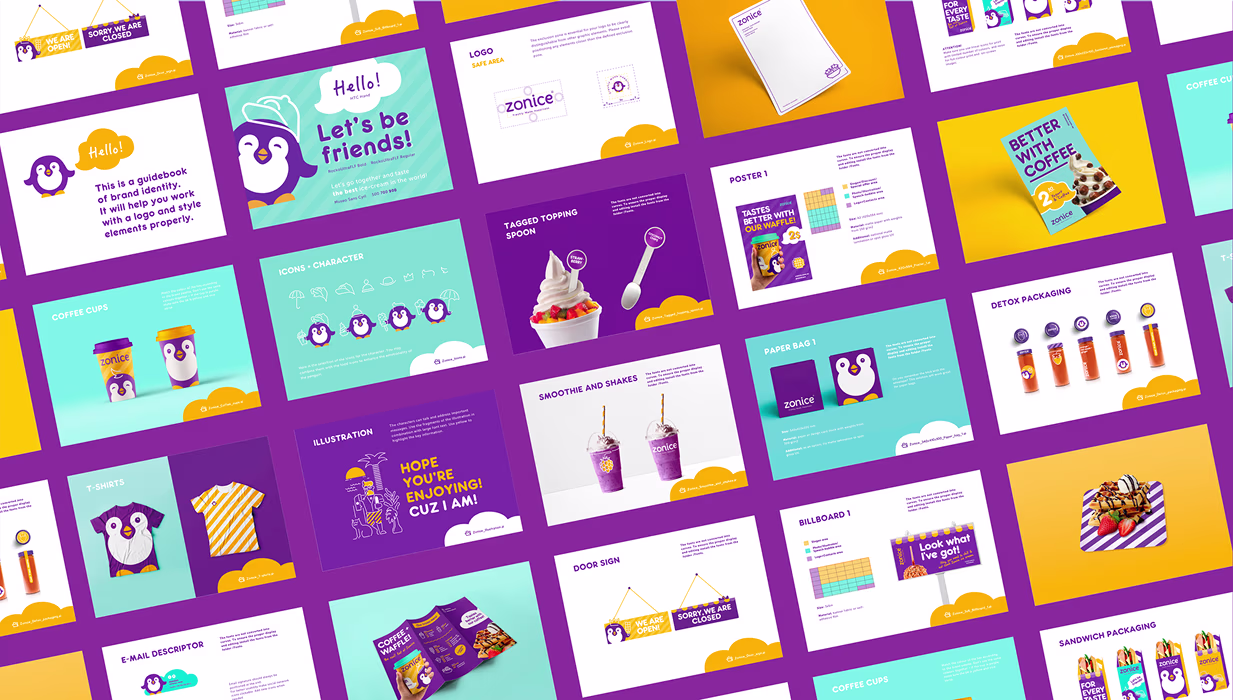
We crafted a joyful, vibrant branding system that mirrors Zonice’s cheerful and friendly character. The slogan "Freshly Made Happiness" captures the brand’s commitment to fresh ingredients and emotional satisfaction, resonating naturally in both English and Arabic. A full set of custom illustrations, playful visuals, and detailed guidelines brought coherence to the brand across physical and digital channels. With its rebranding, Zonice gained a distinct local voice with global potential — ready to expand its happiness far beyond its original market.
Zonice, a frozen yogurt café chain in Saudi Arabia, needed a complete brand refresh to elevate its identity and prepare for growth. The challenge was to modernize the visual language, sharpen the brand strategy, and create a
unified system covering all brand touchpoints — from logo and slogan to packaging, illustrations, and spatial design. Importantly, the new identity had to connect equally well with both English and Arabic-speaking audiences in a franchising-friendly format.
.avif)
%20(1).avif)
.avif)
.avif)
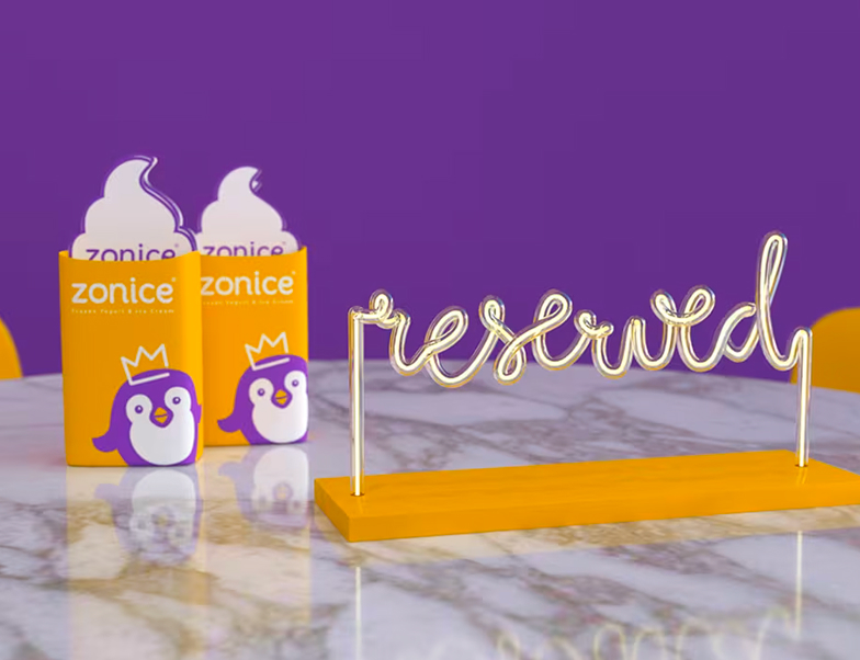
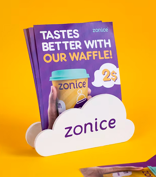
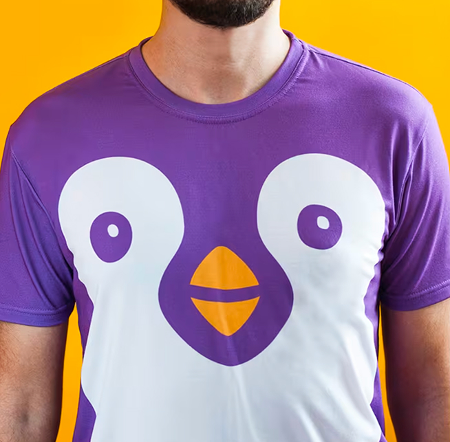
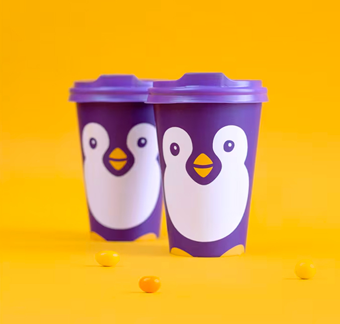
Zonice brand has a cheerful, friendly, and happy tone of voice. Hence, we revised all the brand materials initially and created a branding system with a compelling character, descriptive and detailed illustrations and other various brand assets that transmit this tone in the solely bright and precise way subsequently. “Freshly Made Happiness” is the slogan that highlights the true essence of the core values of Zonice brand. We found it critical to emphasize that only fresh ingredients combined in order to deliver pure and genuine happiness. Fortunately enough, it rather sounds good in Arabic, at that 🙂
%20(1).gif)
.gif)
Most of the mass food serving business in Saudi Arabia is built on franchising. It was important to develop a robust and well-established local brand that could easily communicate with its customers in both English and Arabic tongues. Rebranding strengthened the perspectives of growing the business within the local market and provided its further expanding to other countries down the road.
.avif)
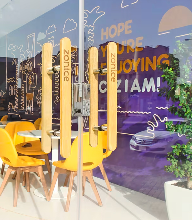
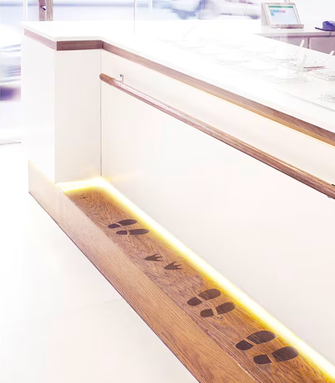
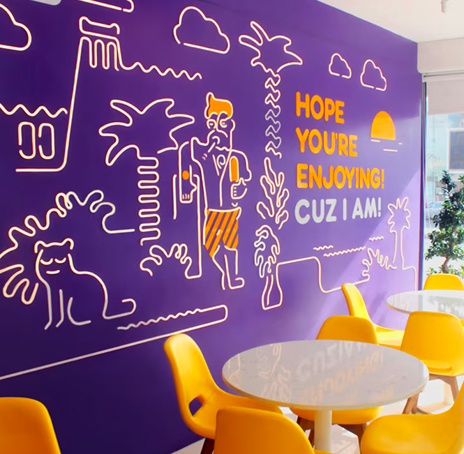
The neon is one of the main brand assets of the style. Basically, it is the drawing of the world “Zonice” with its numerous characters and unique atmosphere on the walls of a cafe and some of the branded items. This aspect adds a dynamic touch to the style, thereby making it literally talk with the visitors. The Penguin, who is the main Zonice’s hero, has just written the word “Cool” on the exterior signage, while the neon thread, which is built in the floor starts from the outside and leads inside, saying “Hello”.
.avif)
%20(1).gif)
%20(1).avif)
Zonice is presented in a number of locations all around Saudi Arabia. One of our principal tasks was to support the growth of the business by providing every new franchising partner with the correspondent materials. We are responsible for area planning, technical documentation and 3D visualizations of new locations, let alone we supervise our client on every step.
.avif)

