A large filling station chain in Russia*.

*Russia is a terrorist state, so now we have no business connections with it.
+30 Projects delivered
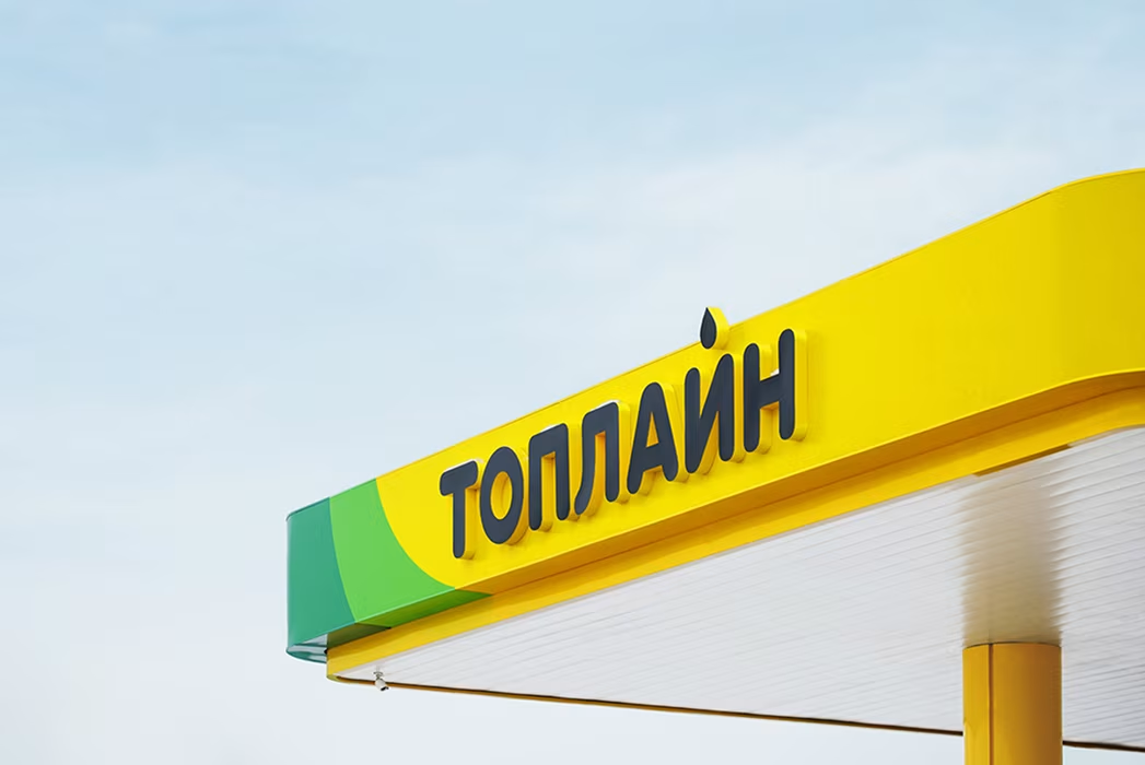
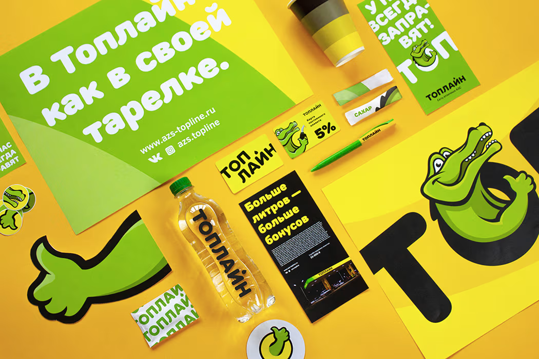
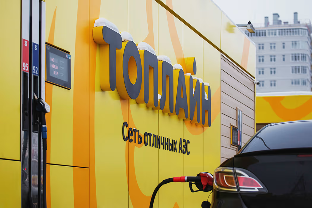
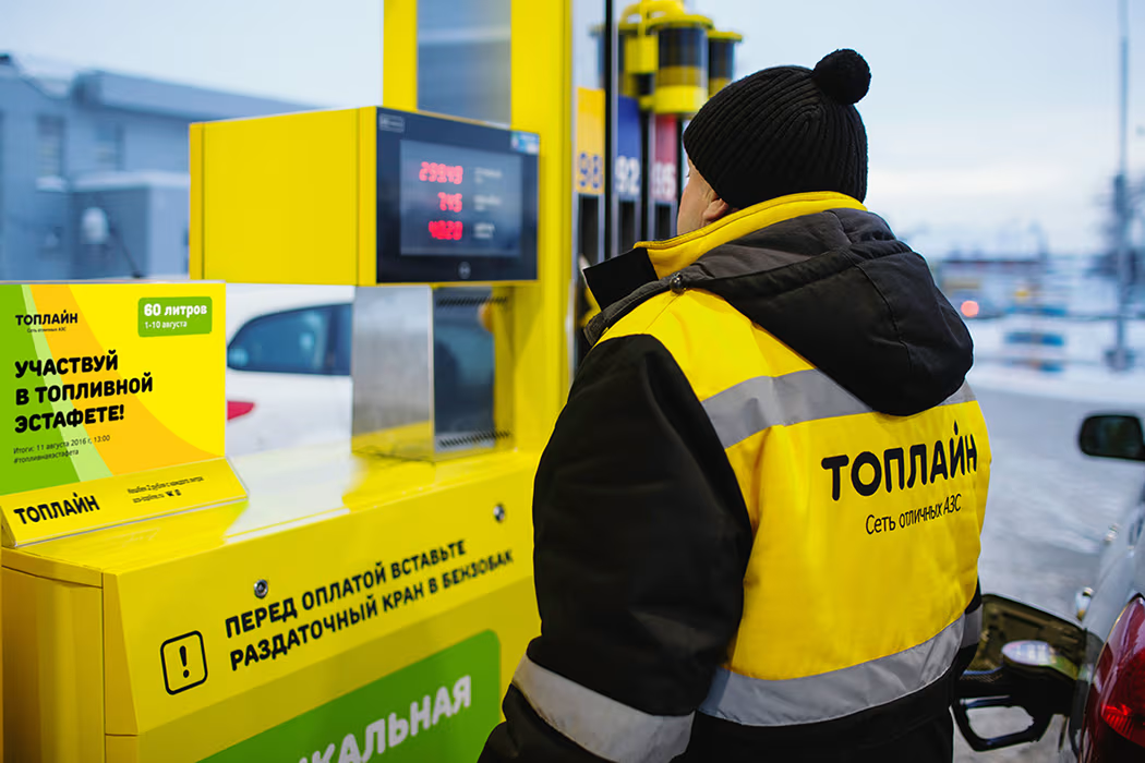
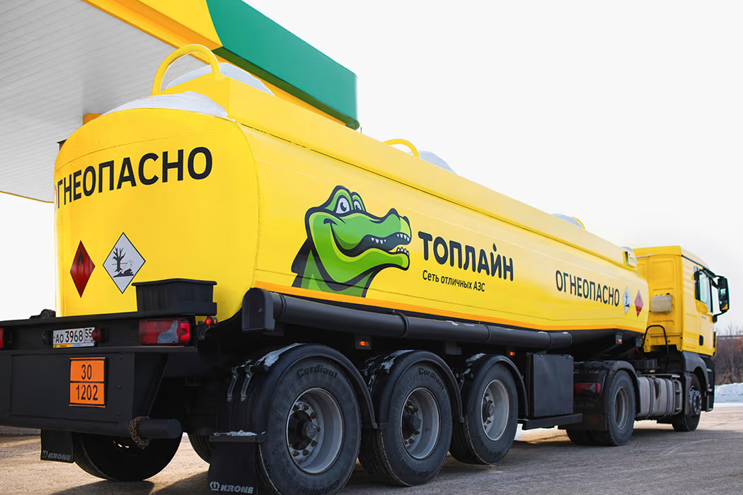
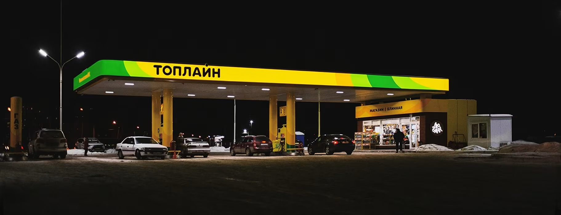
We kept the crocodile logo, making it more friendly and dynamic, and paired it with the modern TT Rounds font and a new slogan: "The network of excellent filling stations." The visual identity was expanded with bold, flexible graphic elements used across all brand materials.For the stations, we developed cost-effective and adaptive design solutions, customizing each site based on architecture and layout. Over 20 of 45 stations were redesigned, with work ongoing since 2014.
Topline, one of the largest fuel station networks in Omsk, approached us for a complete rebranding. The scope included updating the logo and identity, developing station design guidelines, and creating uniforms, vehicle branding, POS materials, and navigation. The design had to work with existing buildings and a strict budget.
%20(1).gif)

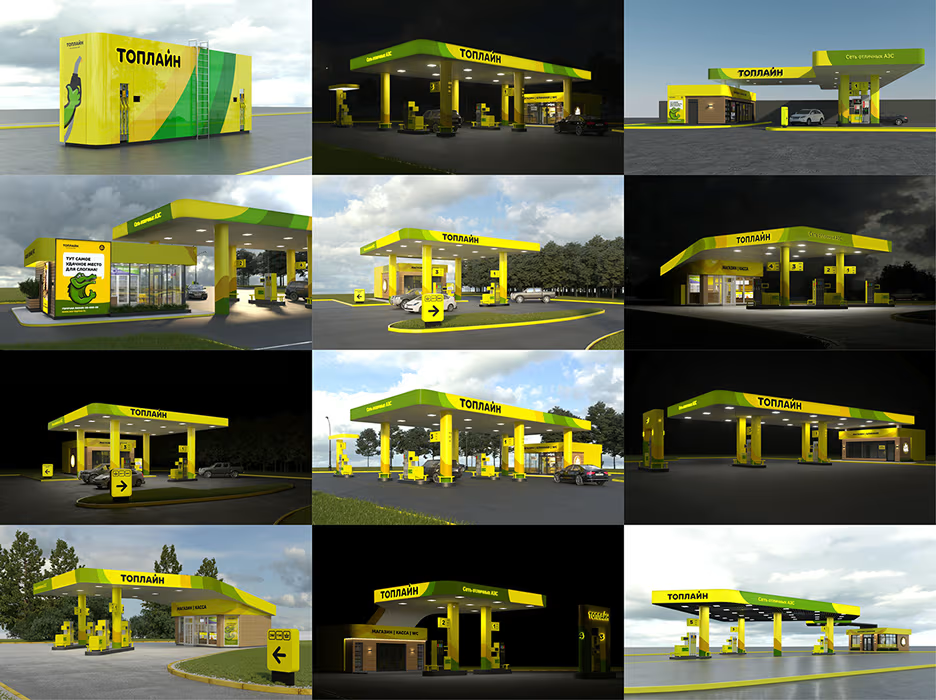
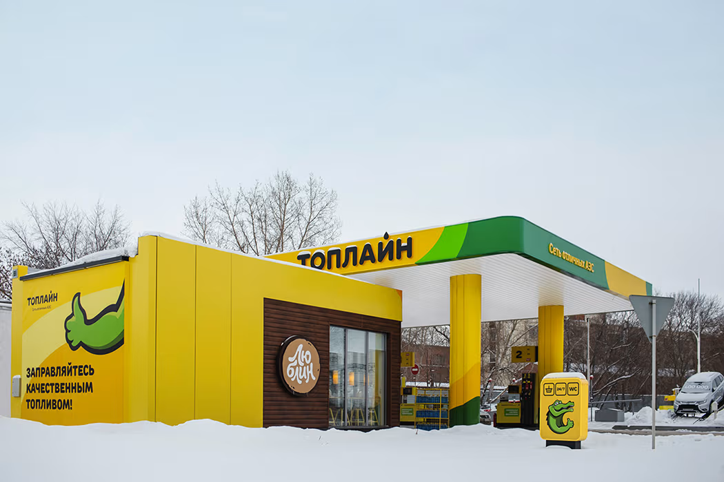
There are 45 filling stations in the network. We developed the design for over 20 of them. The client approached with a task to realize the project within a strictly limited budget, which explains the choice of budget materials for the construction purposes. We had to work with the existing station buildings, so our solutions had to be adapted to their shape. For that reason all filling station has an individual design and for some we have developed purpose-tailored compact solutions. The ongoing work started in 2014
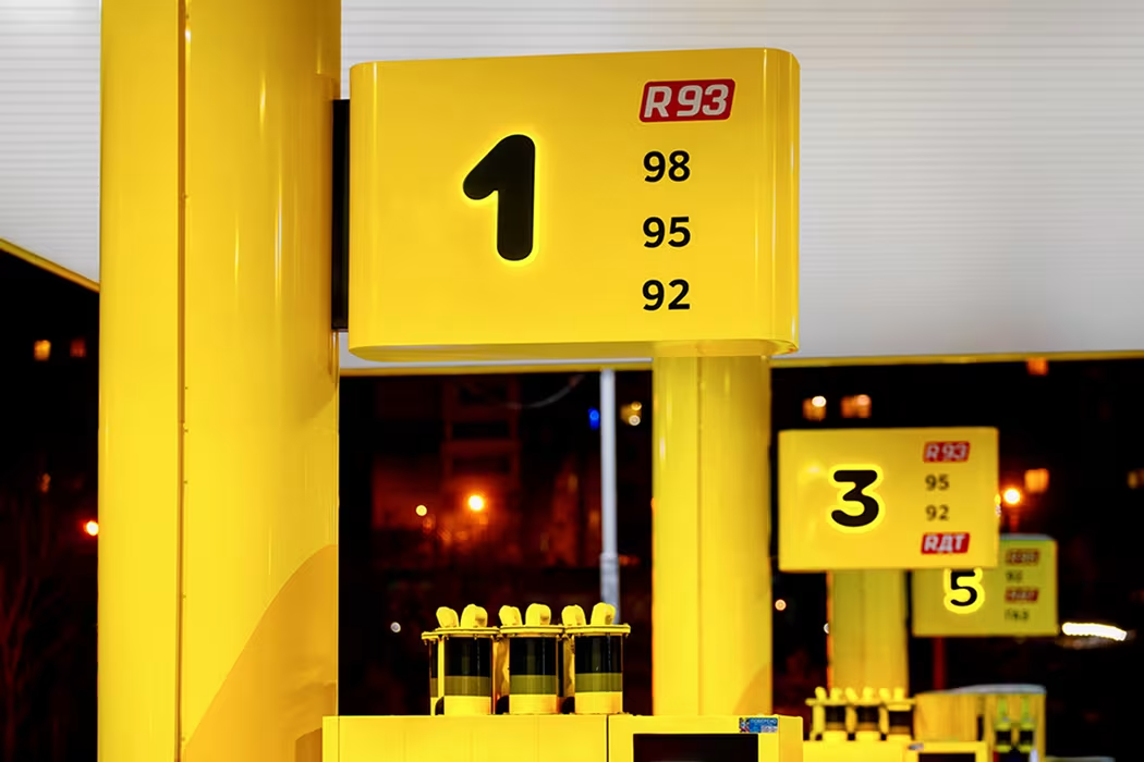
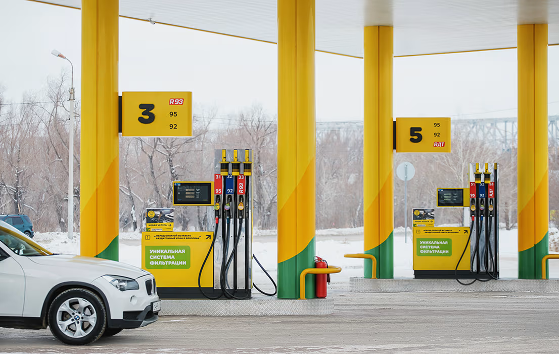
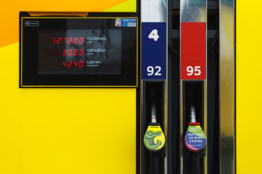
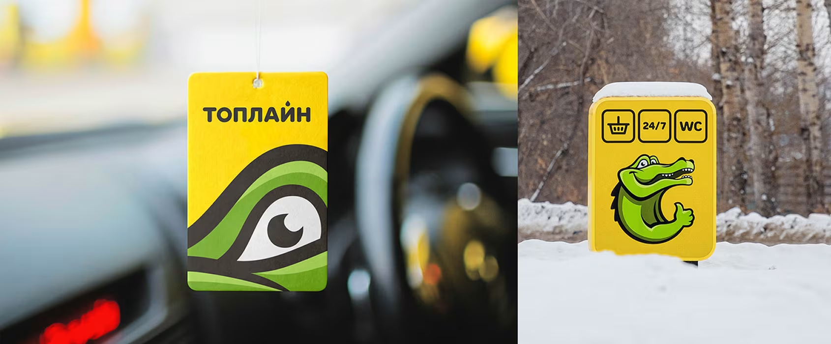
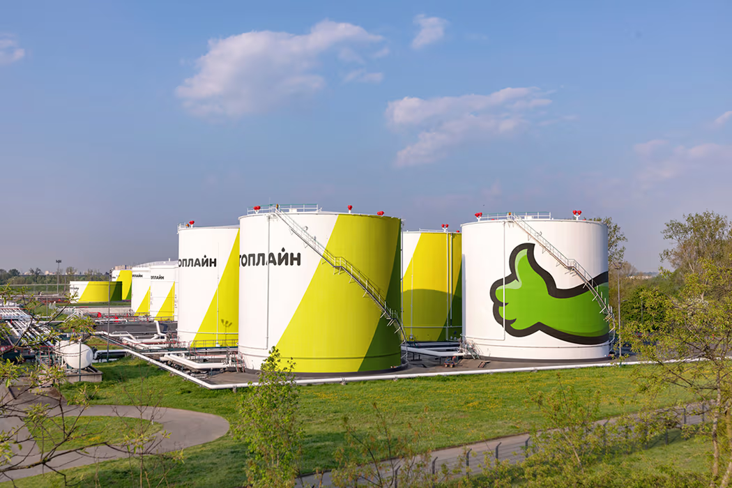
Apart from the fuel stations, we designed stationary, apparel and promotional materials: staff uniform, vehicle design, advertising mediums, POS-materials, navigation system etc.


.avif)

