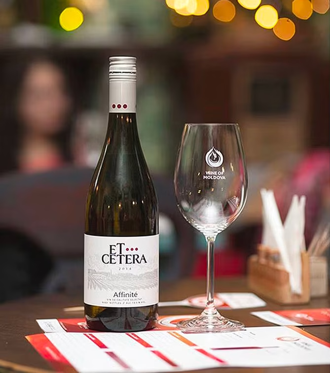
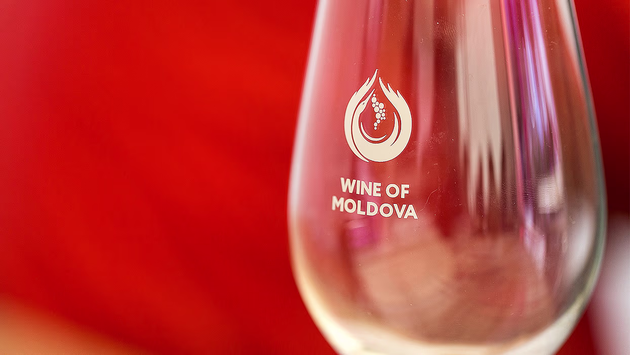
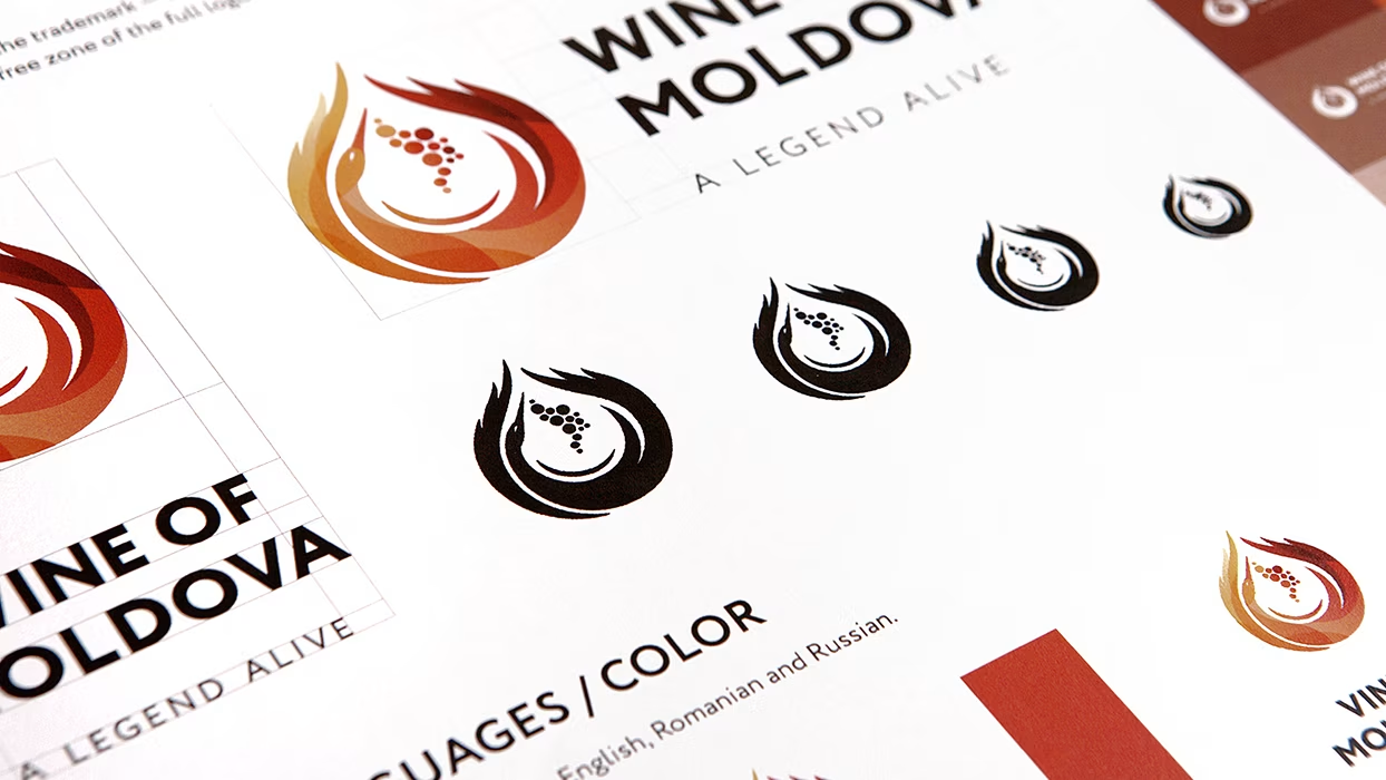
LOGO
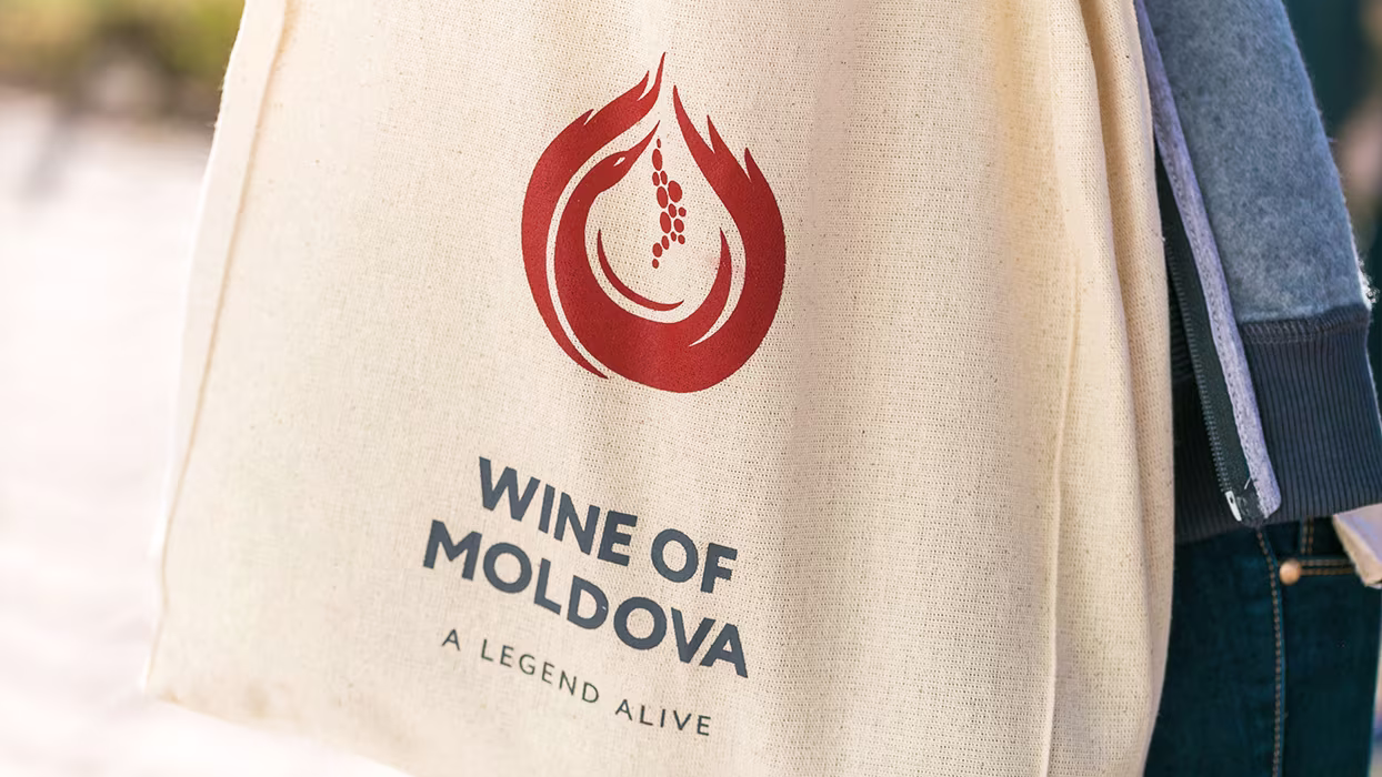
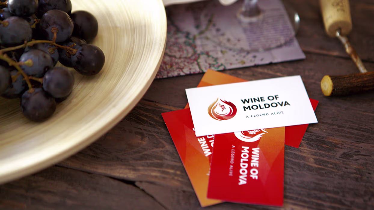
Logo represents a stylized image of a white stork with a bunch of grapes. White stork in this concept is a traditional symbol and a sign of the quality of Moldovan wine growing and winemaking. Aside from the obvious symbol of a stork, there is a number of additional meanings higgen in the sign. For instance, the overall silhouette is designed in a shape of a drop of wine, wings make up the image of flames, and the bunch of grapes follows the contours of Moldova on the world map ultimately. Thus, the brand name is a combination of four elements. The grapes represent a symbol of the earth, stork is a symbol of the air, wings became the fire, and a drop of wine symbolizes water.
.avif)
.avif)
.avif)