A new Ukrainian fitness club with a focus on aesthetic design.


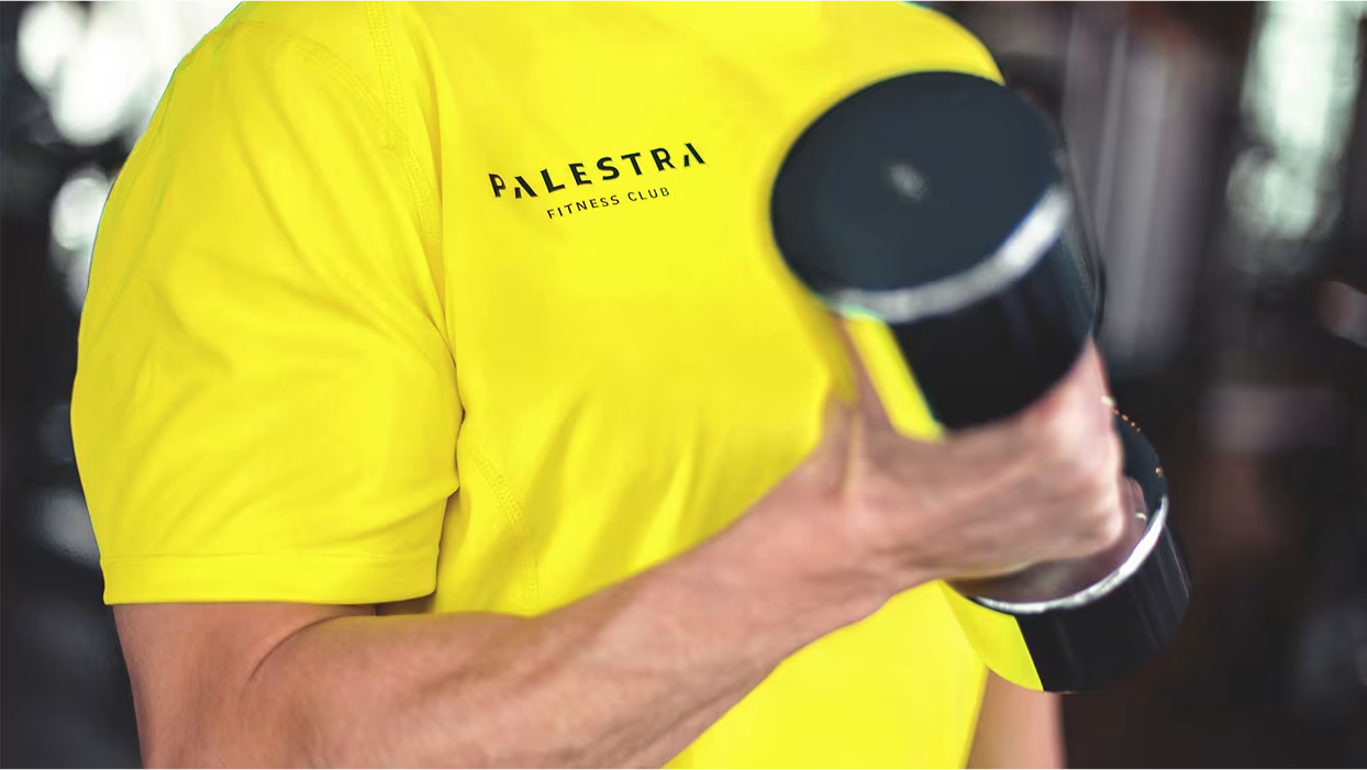
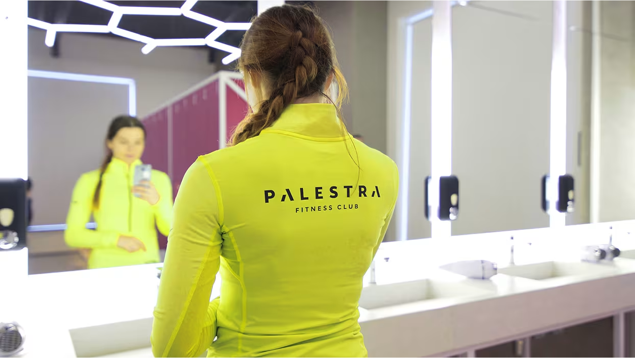
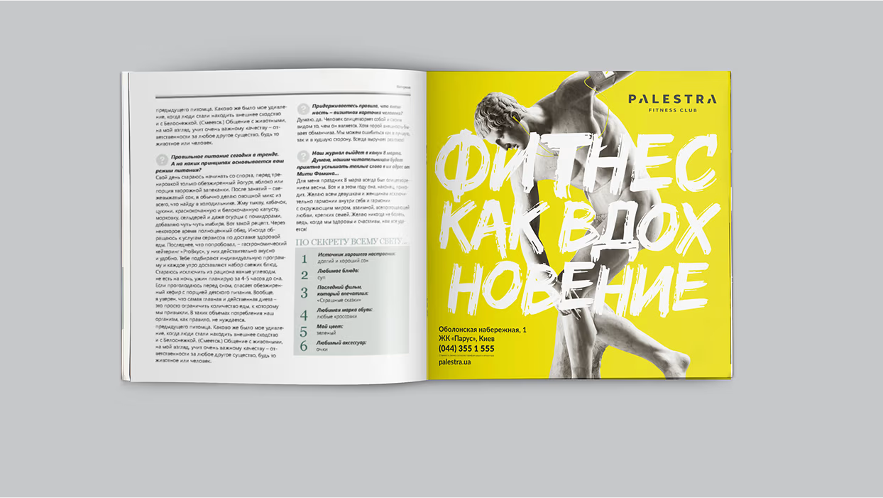
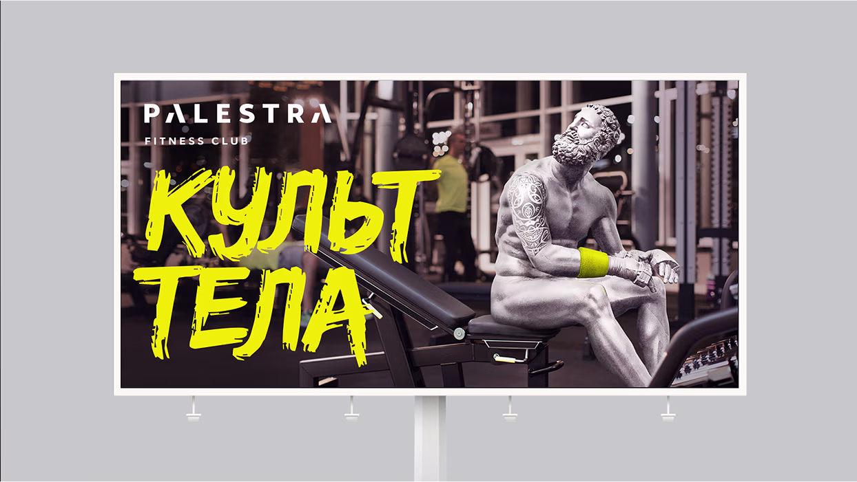
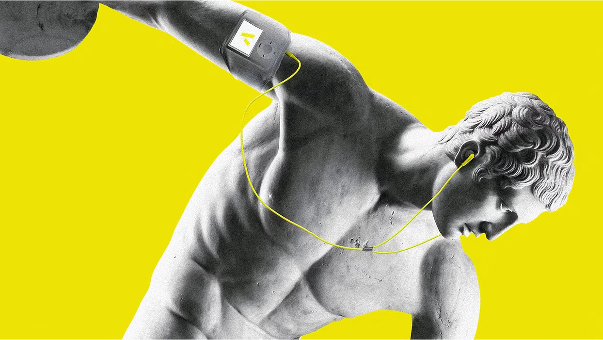
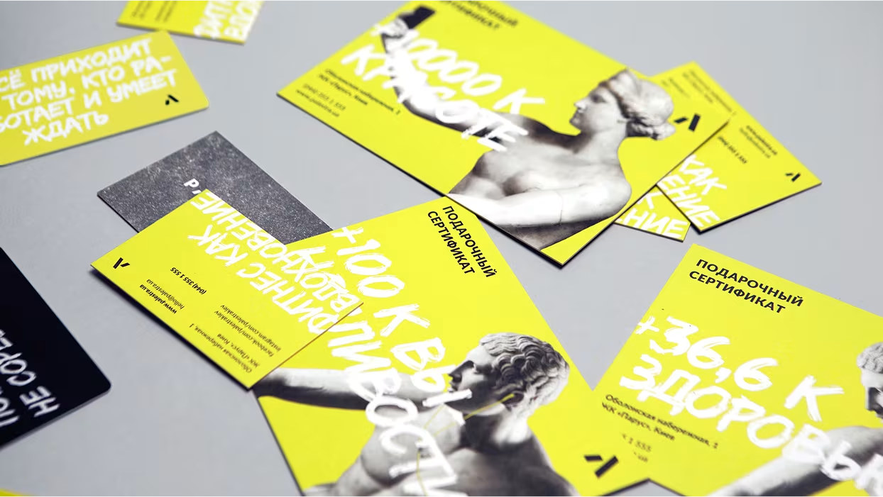
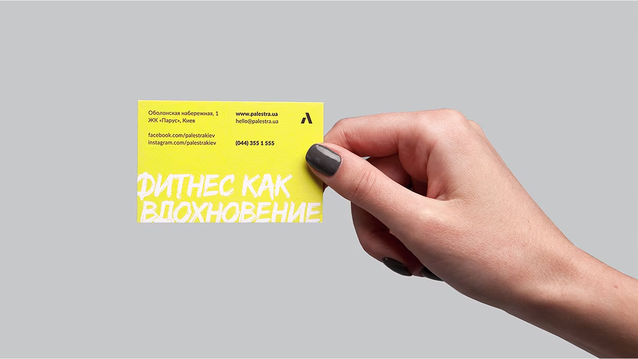
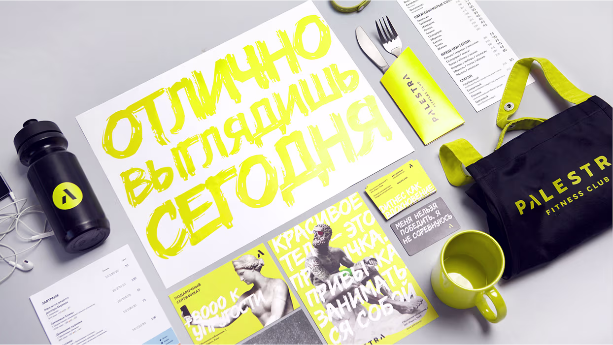
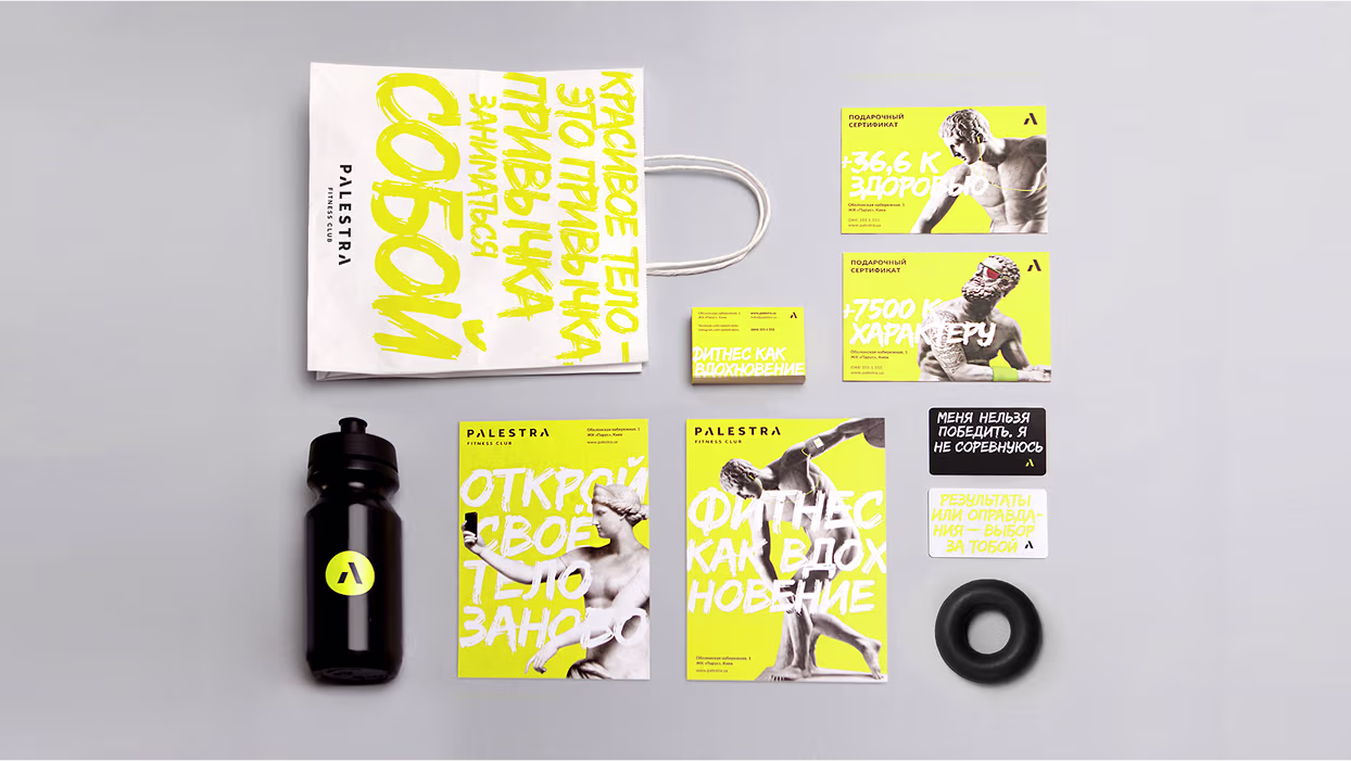
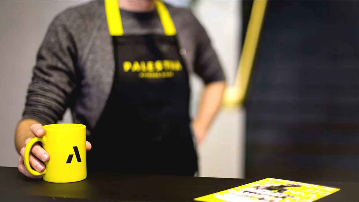
We developed a bold visual concept rooted in the historical symbolism of the word “Palestra,” referencing ancient Greek training schools. The logo features the Greek letter “λ” (lambda), used as a standalone symbol and across various brand formats. The corporate identity draws on iconic Greek sculptures — such as the Discobolus and Boxer of the Quirinal — updated with modern fitness gear to bridge the ancient and the contemporary. We extended the identity to stationery, club-restaurant branding, and interior spaces in collaboration with S&T architects, ensuring that the aesthetic seamlessly translated across all physical and visual elements of the club.
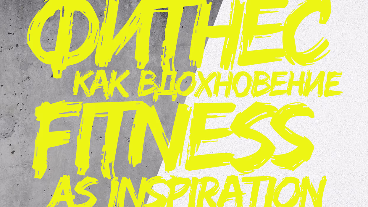
The task was to build a distinctive brand identity for a new premium fitness club, Palestra, whose mission is to inspire a healthy and balanced lifestyle. The challenge extended across multiple touchpoints: creating a memorable logo, designing a cohesive corporate identity, launching a campaign that connects emotionally, and integrating visual branding into the club's interior. It was essential to blend classical inspiration with a modern fitness philosophy to differentiate Palestra in a competitive market.

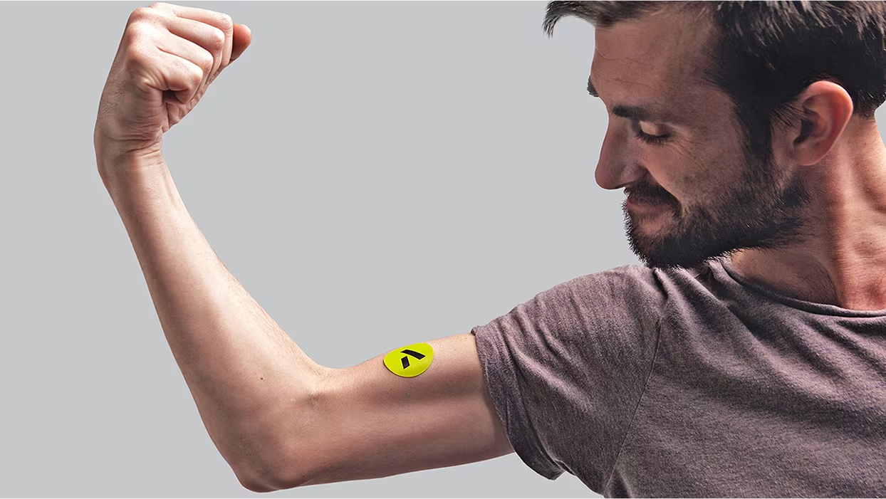
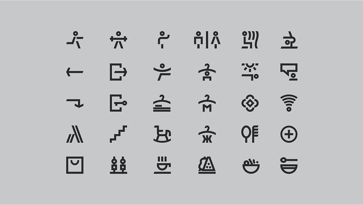
Palestra (from Greek Παλαίστρα) — is a private gymnastics school in ancient Greece. Generally speaking,this word was used as an institution in which young people tended to learn different kinds of sports. In modern Italy the word has a common usage, which means “gym”. The core concept contains the idea of inclusion of the Greek letter “λ” (lambda) in logotype and usage of this letter as a logo itself. System of differentiation of individual formats within the brand Palestra.


In addition to all printed materials (business cards, club cards, price lists, gift certificates, flyers) we also have fully branded the stationery of the club-restaurant.
.gif)
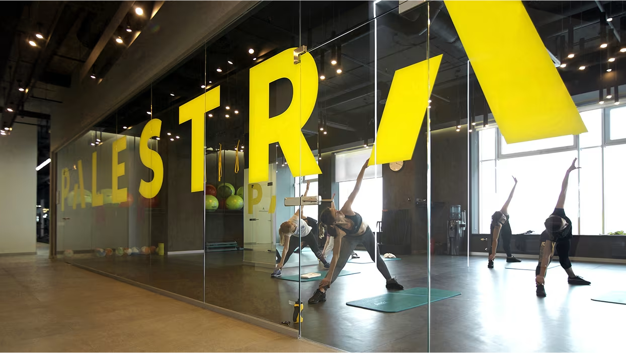
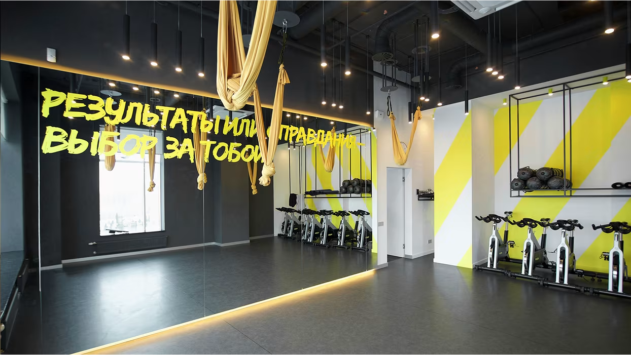
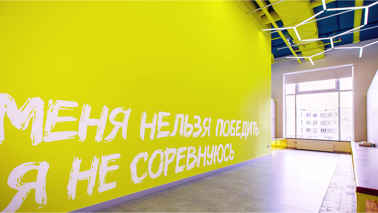
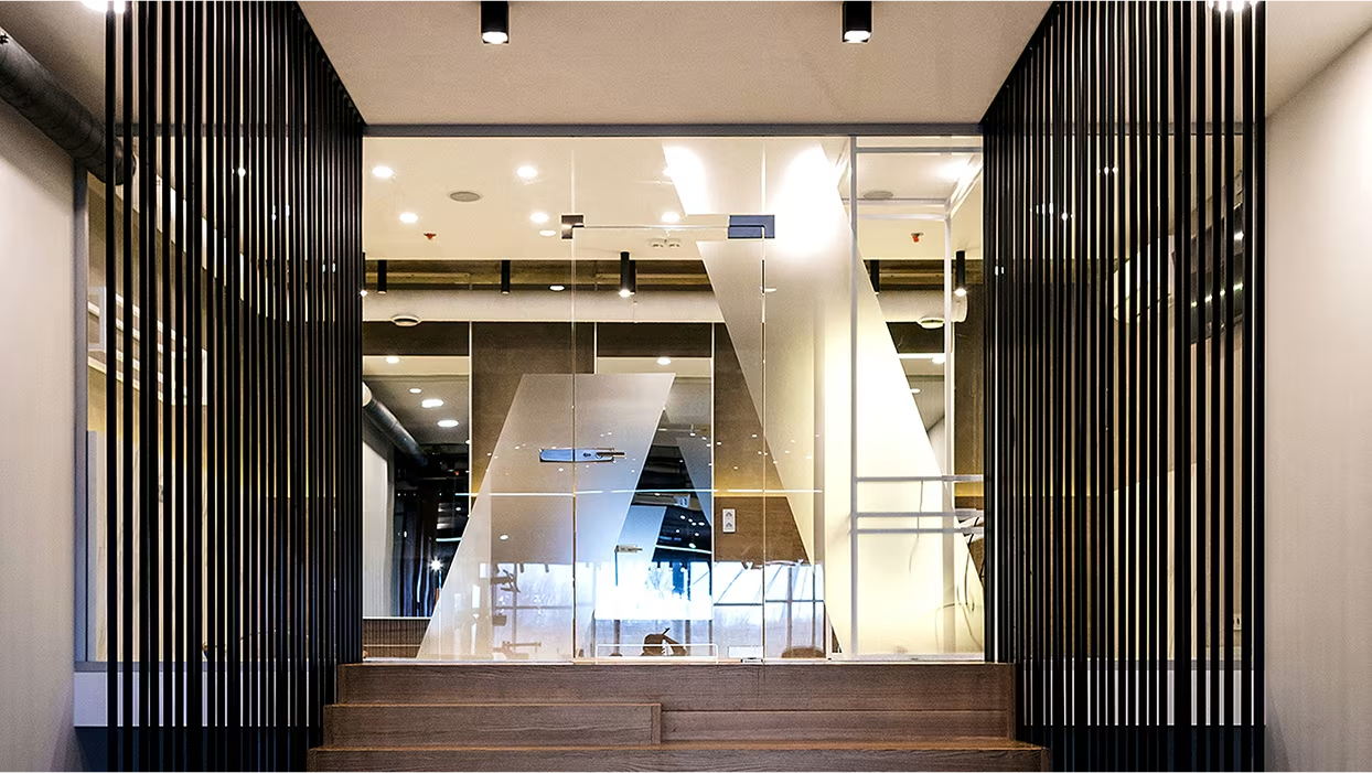
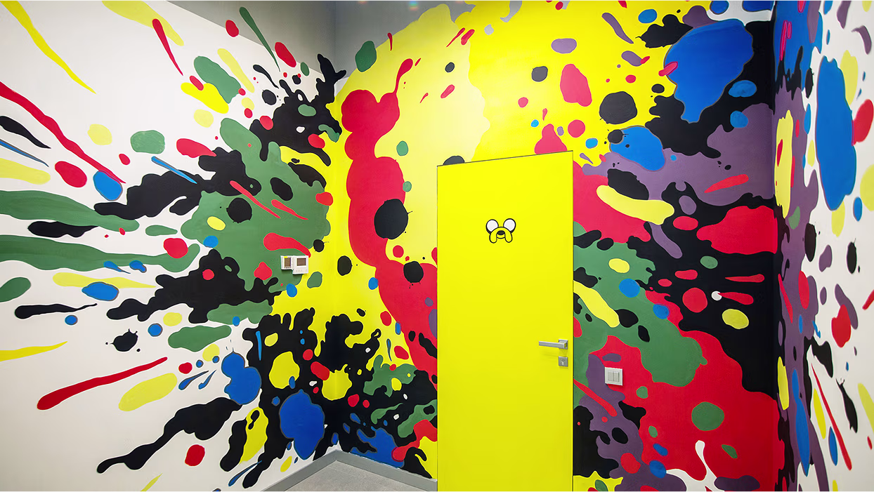
We have been developing interior branding aligned with S&T architects agency. As the architects created the overall design, we focused on implementing corporate identity elements in the specific spaces and locations.
.gif)
.gif)