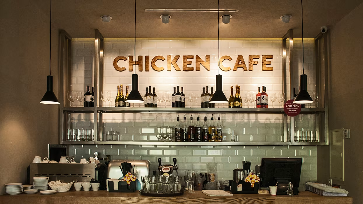
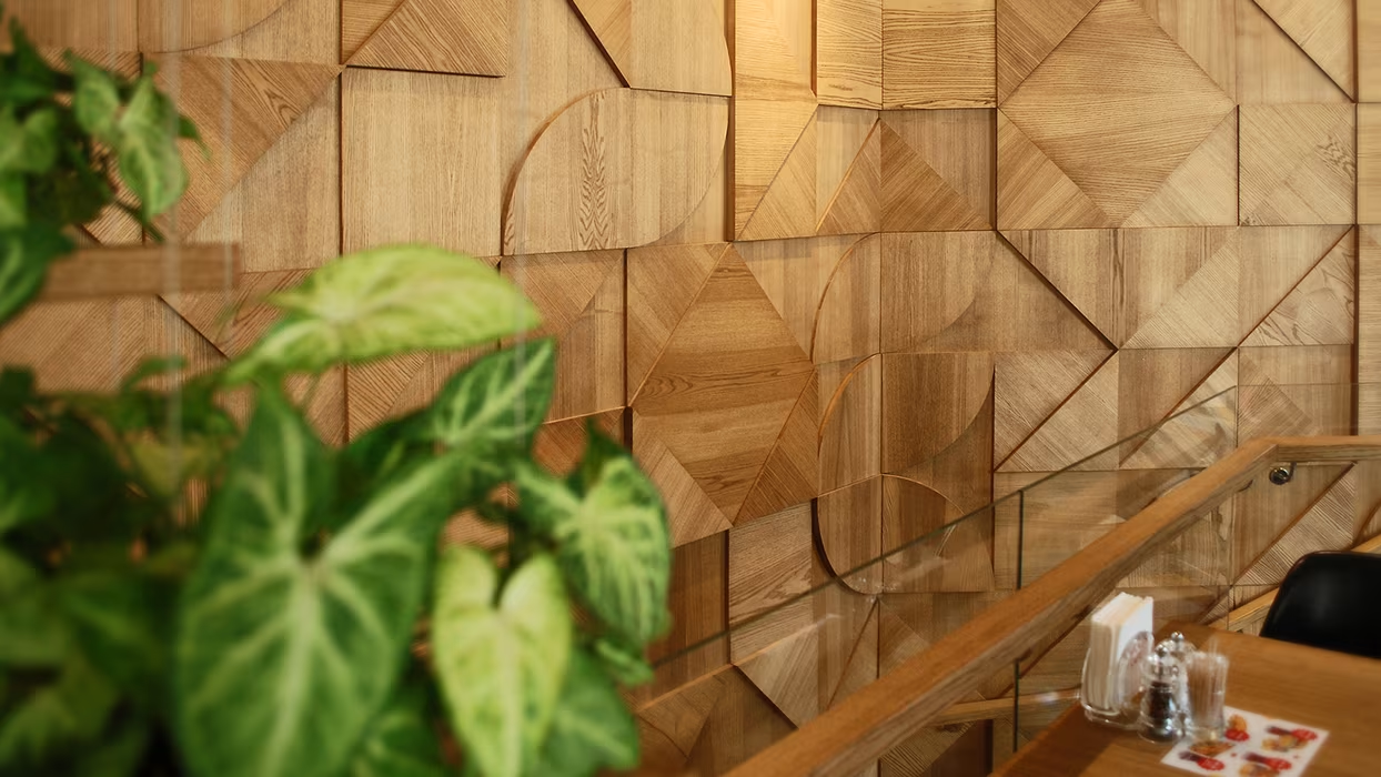
A new cafe with fast-food done from chicken and eggs in Ukraine.

.gif)
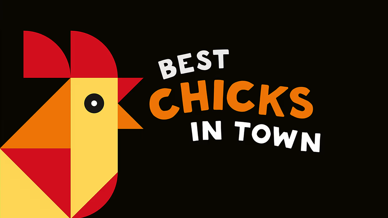
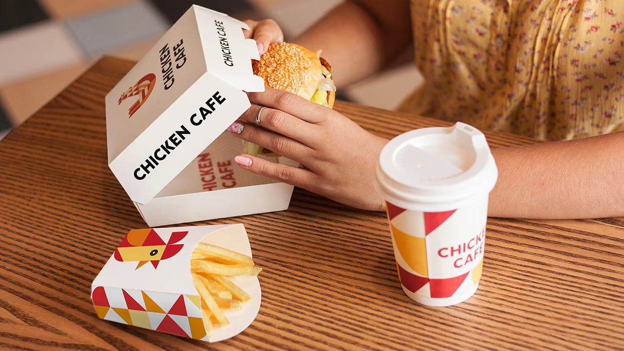
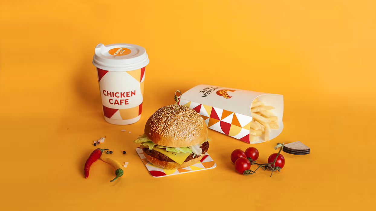
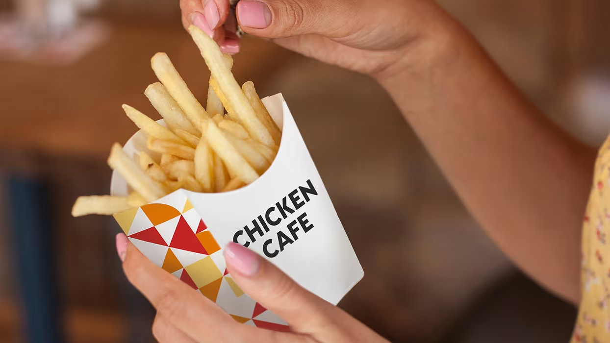
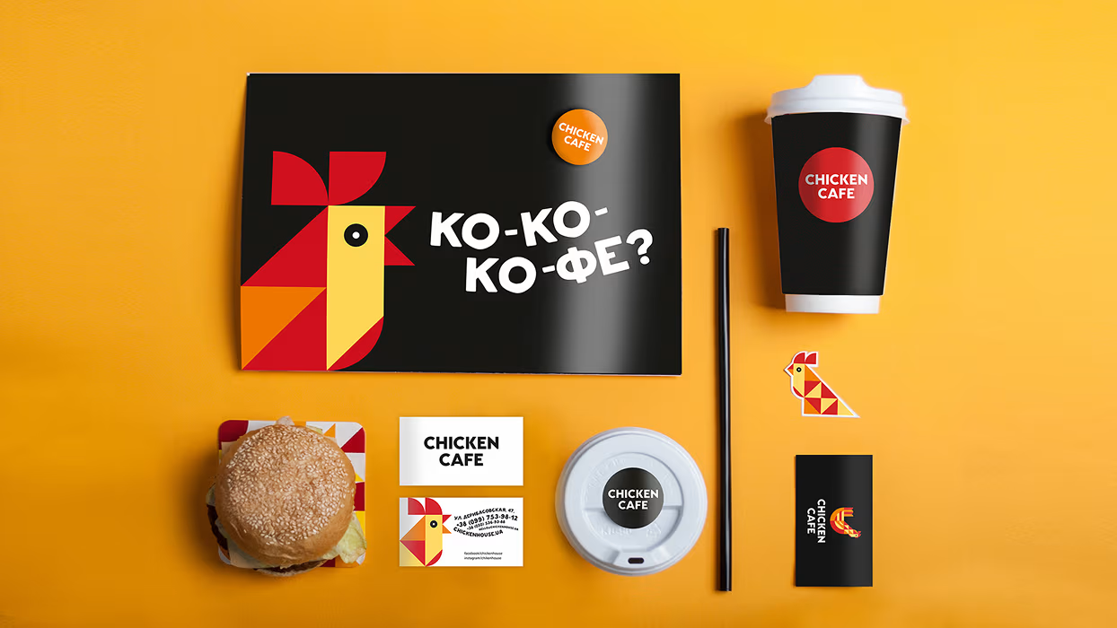
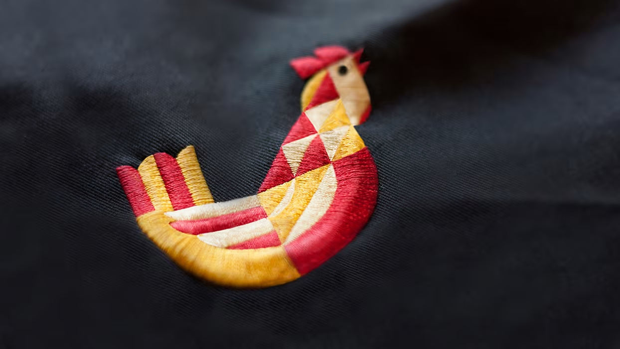
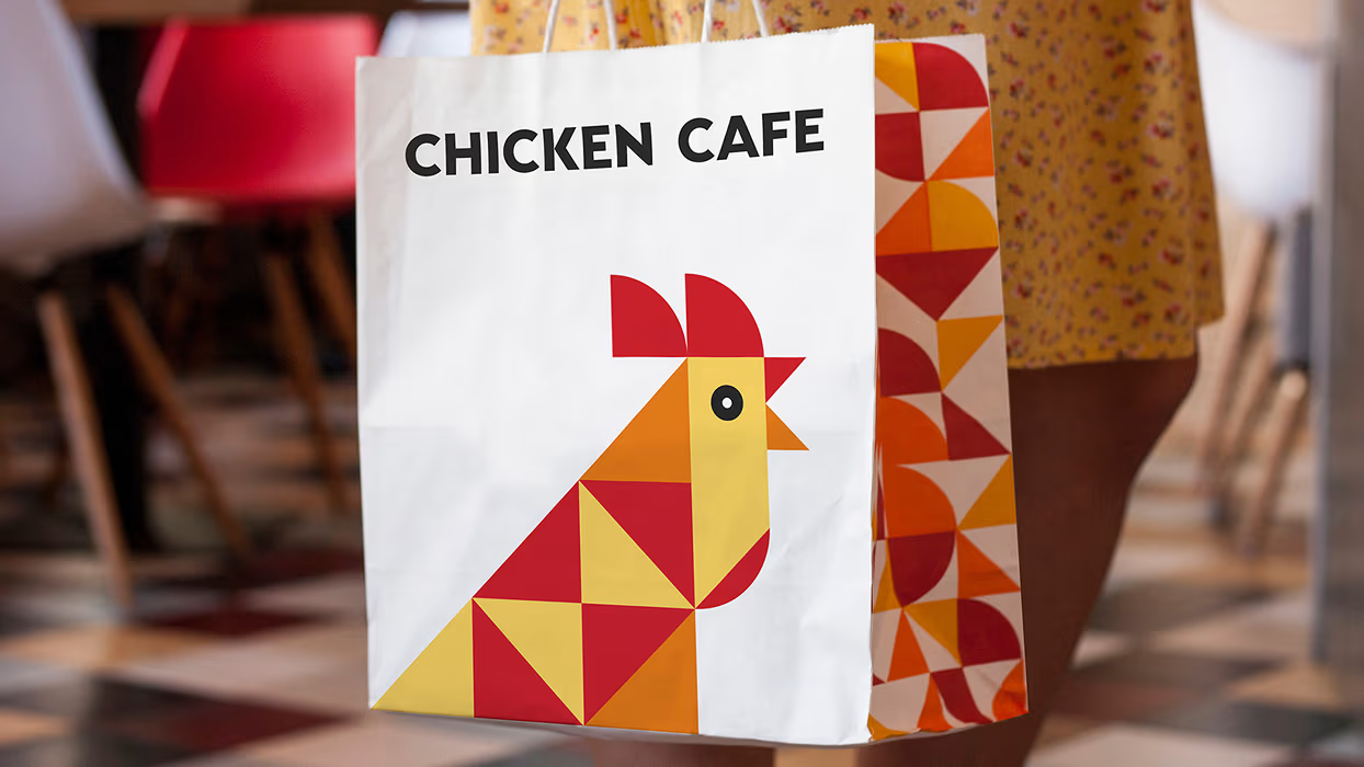
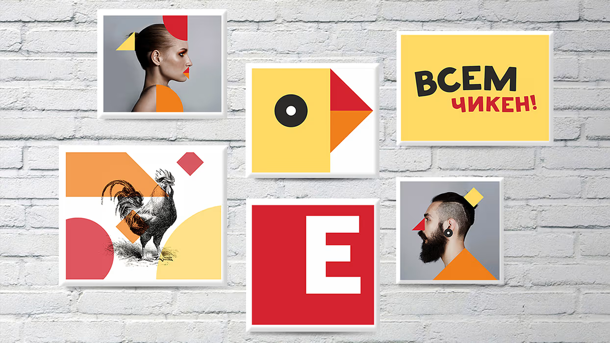
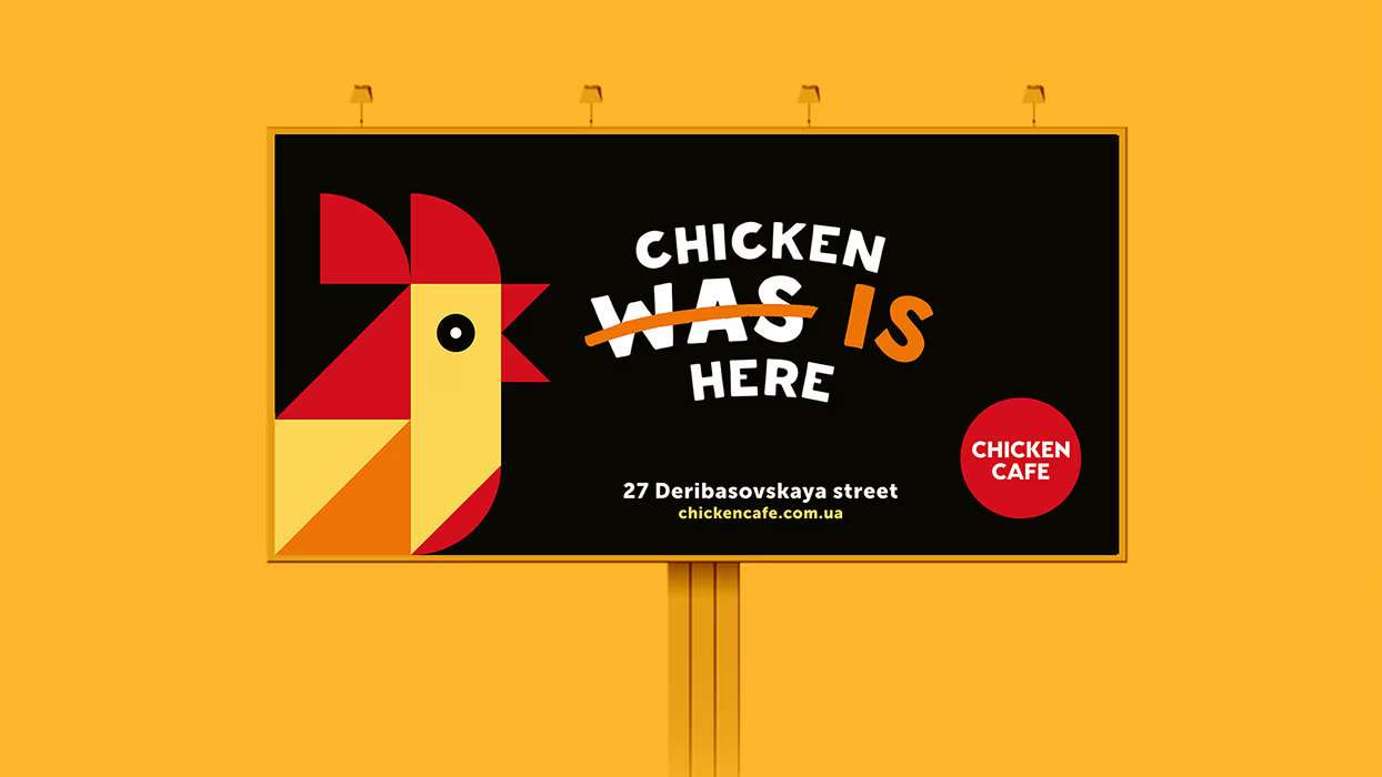
The symbol represents the chicken that is constructed from decorative pieces — a “building” material of this project. The chicken is a main character that communicates with the audience, including all advertising and social media communications. The pattern is made of the same simple shapes the chicken is constructed from. Basically, this constructor that can be used to create a variety of forms and patterns, as well as single pieces can be bright accents for whatever needs.
Challenge: The design of logo, corporate identity, printed goods and branded elements and also the interior branding.
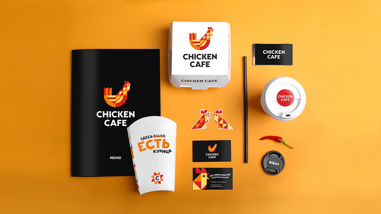
A universal and customizable design solution was developed to make it possible to quickly expand the business to a chain of franchise restaurants, applying the design to any space available for the lease. Brandon Archibald’s unique service “Restaurant Identity™” gave the Woobles operation space its branded look and feel. The brand identity guidelines not only explain how the brand identity should be used but also provides a detailed explanation of interior and exterior design rules and regulations. The colors, materials, furniture, lights, textures, and fixtures were carefully selected and applied to the first location. Now, they can be expanded to any other place within the days saving plenty of time.
