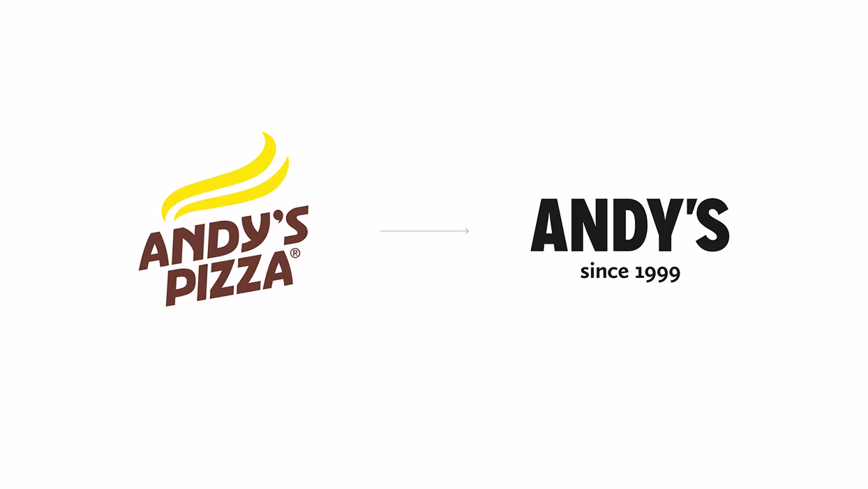
Name: In order to integrate everything together and to keep brand awareness we suggested to maintain the word “Andy’s” and to exclude the word “Pizza”.

A big family restaurant chain in Moldova and Romania.

Brand identity
Hospitality
Moldova & Romania
.avif)
Services
Naming
Floor
Plans
Interior Design
Supervising
Branding
Exterior Design
Duration
~ 8 weeks
Challenges
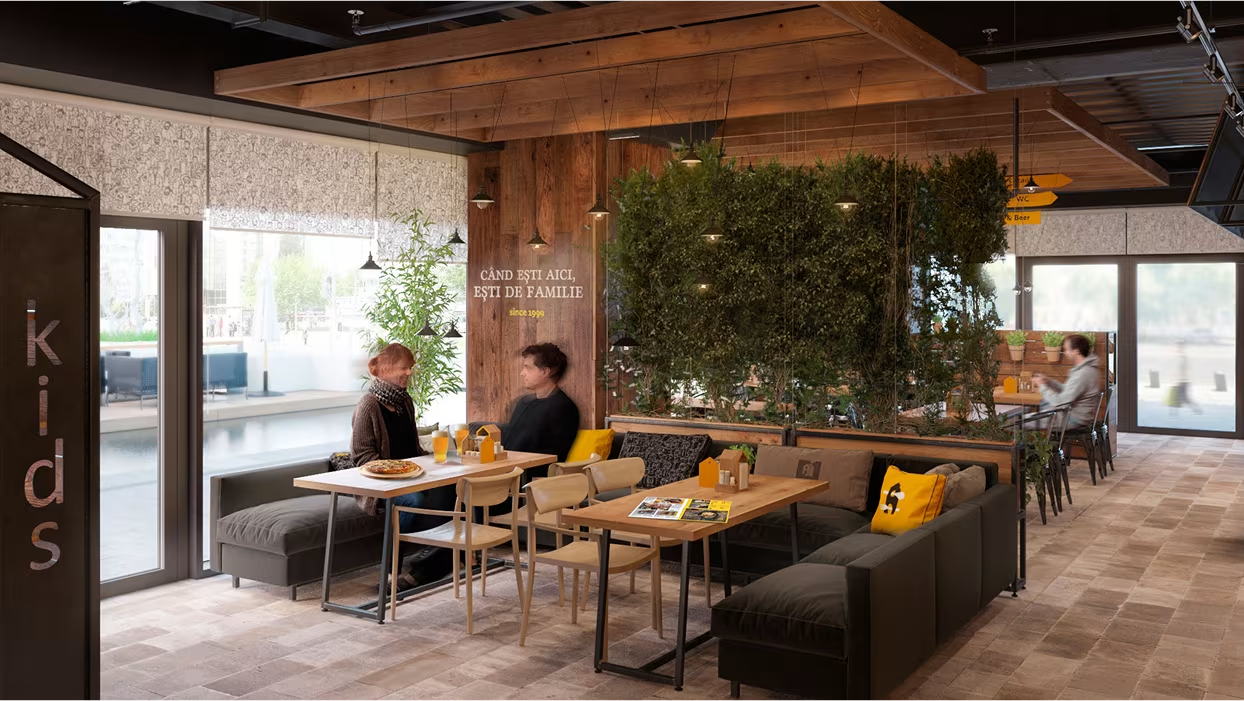
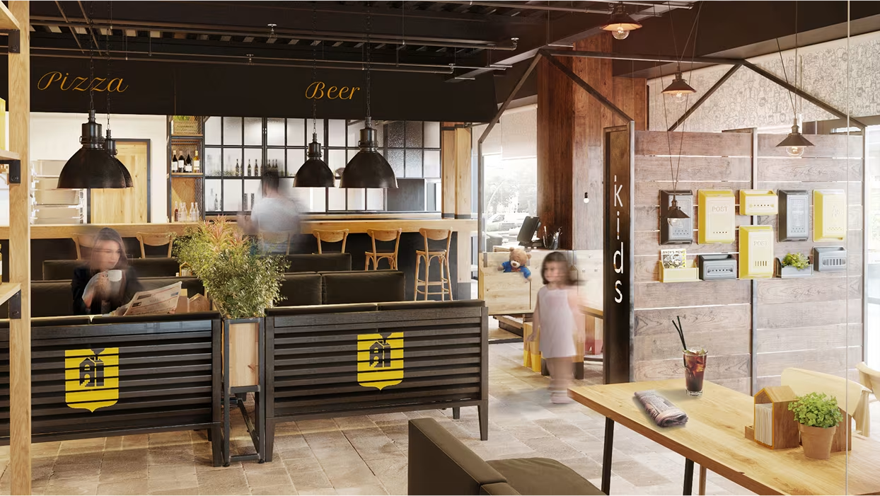
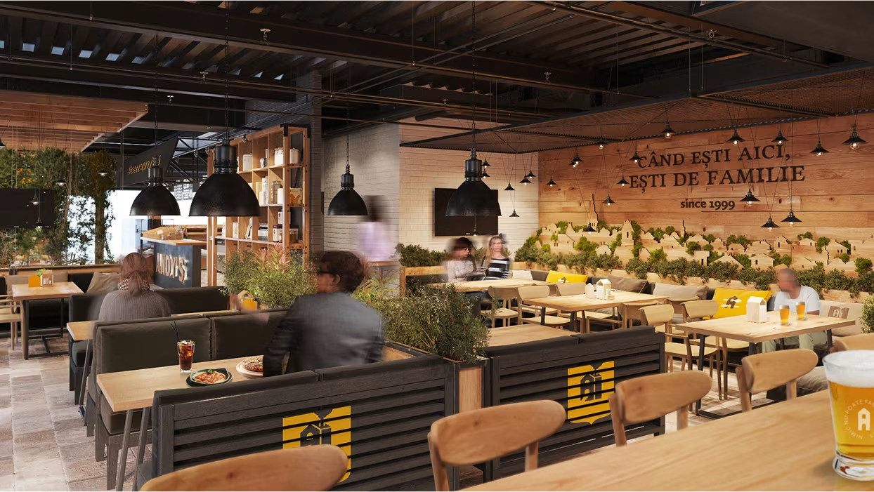
Transform an outdated visual identity into a modern, unified brand across 50+ restaurants, keeping familiarity while integrating multiple zones — trattoria, pub, café, kids’ area — under one concept.
Solutions
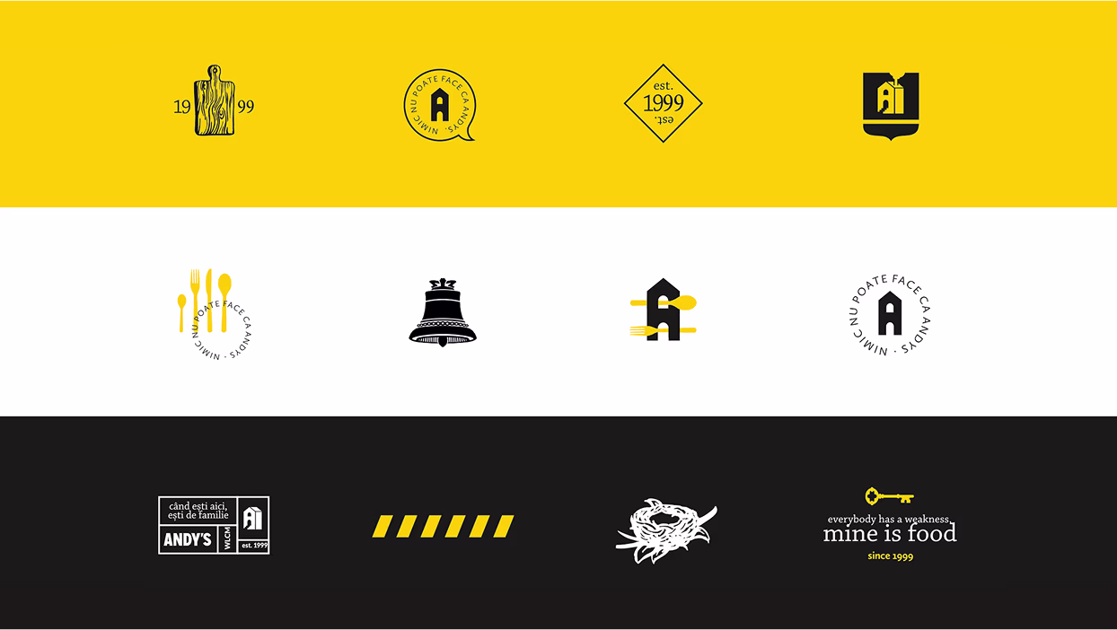
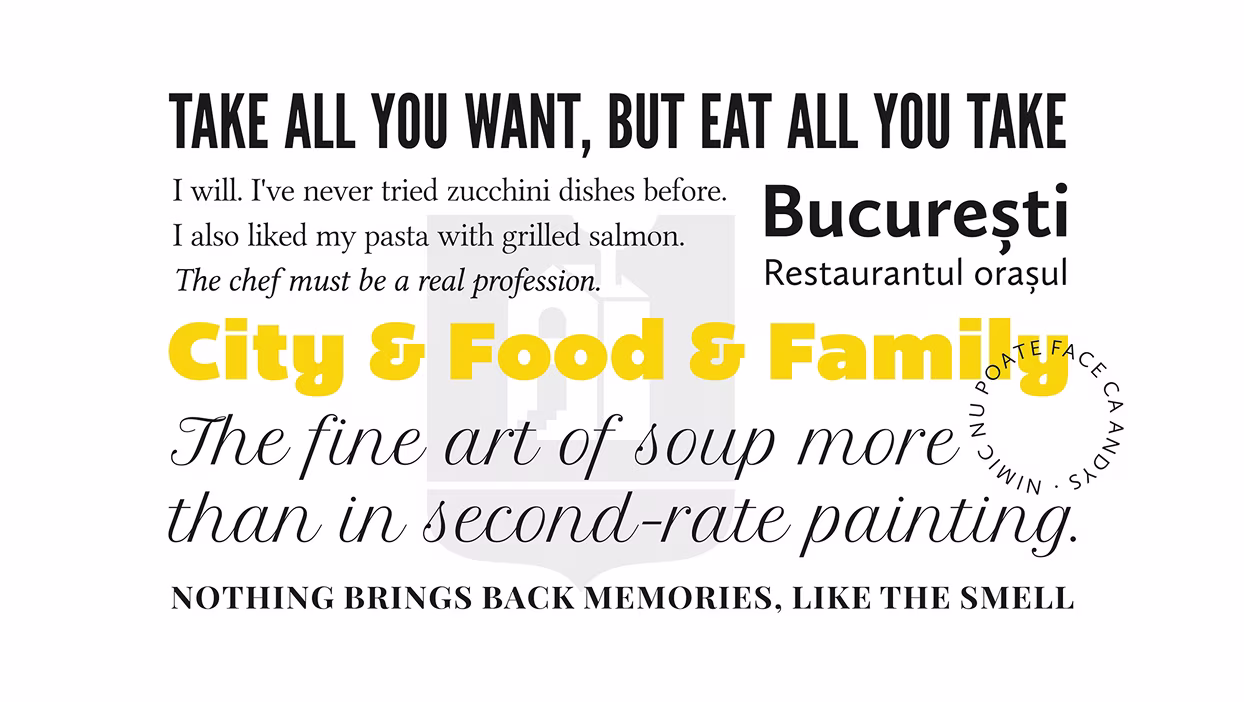
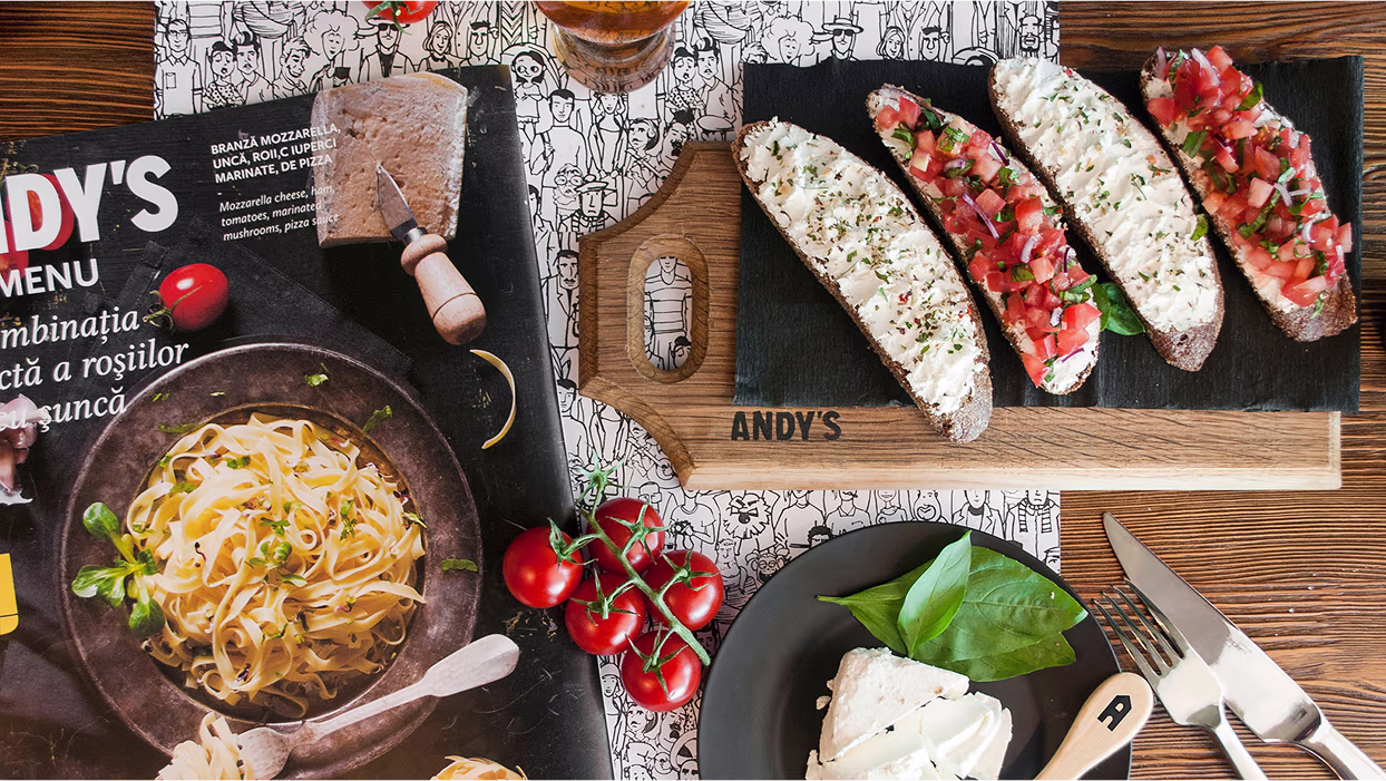
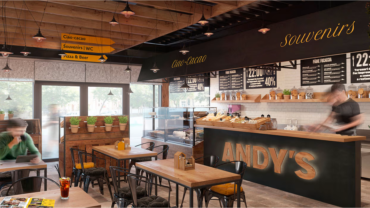
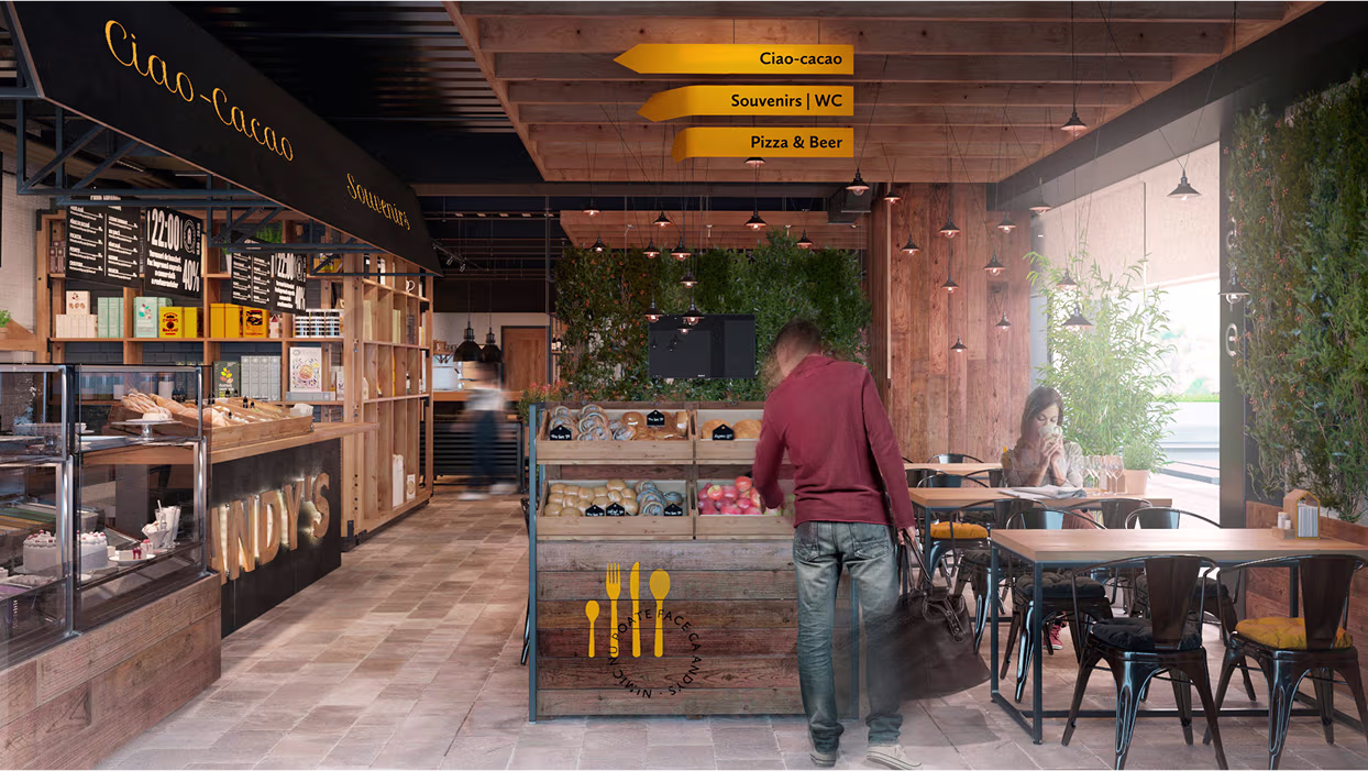
We turned Andy’s into a “city” — lively, diverse, and inclusive. Visual identity was inspired by newspapers: bold fonts, yellow highlights, black & white layouts. The interior became a town square with thematic stalls for food, desserts, and souvenirs. Custom decor like house-shaped spice holders and mailboxes added playfulness and engagement.
We turned Andy’s into a “city” — lively, diverse, and inclusive. Visual identity was inspired by newspapers: bold fonts, yellow highlights, black & white layouts. The interior became a town square with thematic stalls for food, desserts, and souvenirs. Custom decor like house-shaped spice holders and mailboxes added playfulness and engagement.
Preconditions: The first Andy’s Pizza was opened in the year 1999 and served pizza and beer mostly. In future years, the amount of new restaurants increased together with a variety of dishes served. In a while, some new sub-brands were born under the Andy’s Pizza trademark: Ciao-Cacao for self-made ice-cream and cookies, Alb&Rosu for wine, and Andy’s Pizza Club loyalty program. A few separate zones were formed within each restaurant: trattoria (family zone), pub (sport events and beer), cafe (Ciao-Cacao desserts), and a playground for kids.
.avif)
.avif)
.jpg)

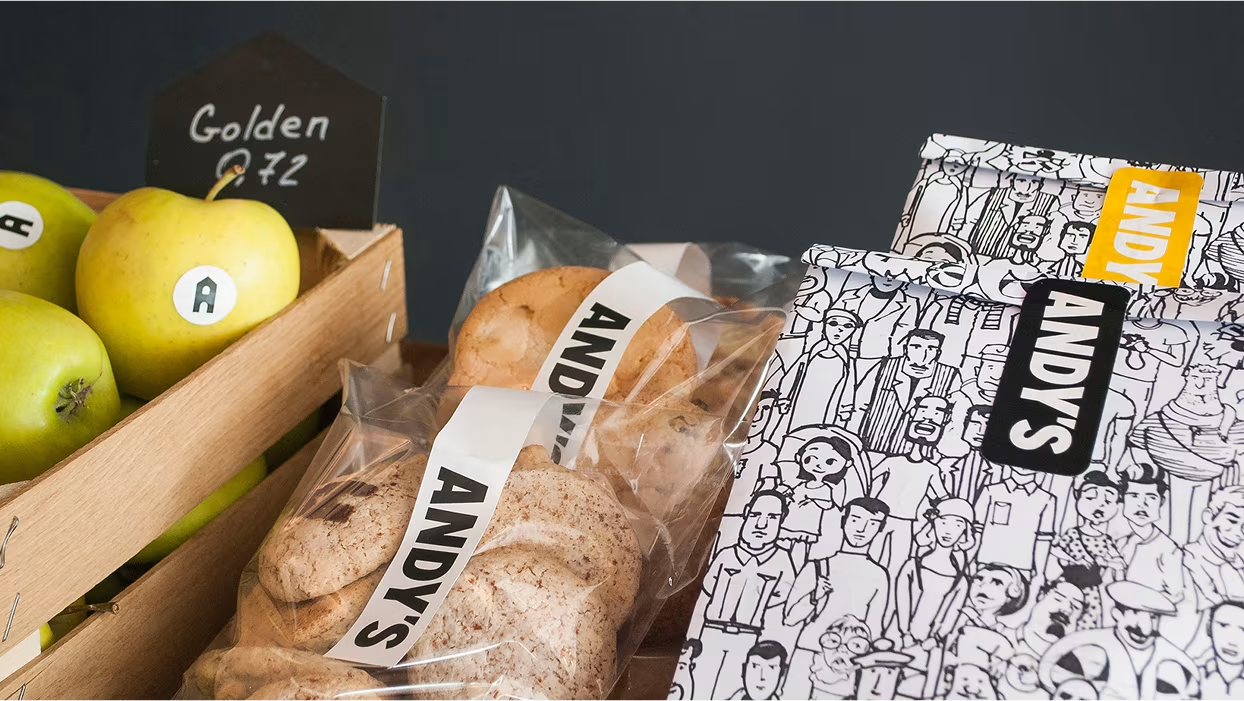
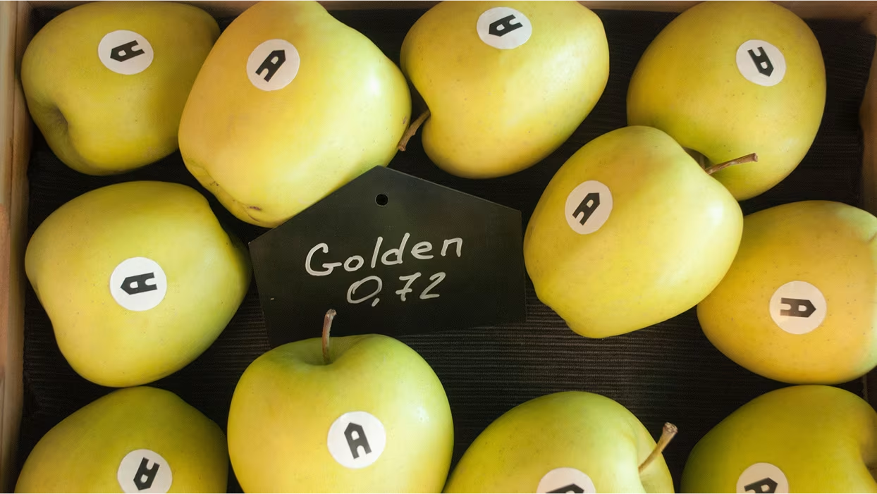
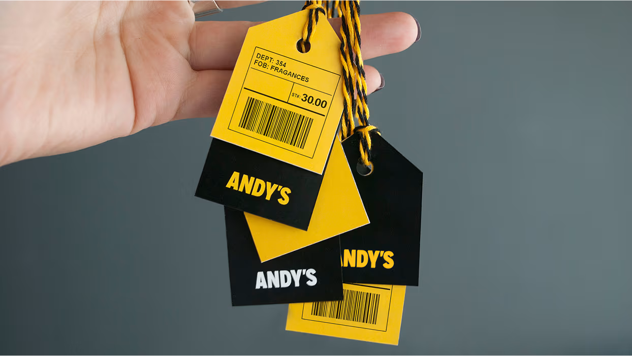
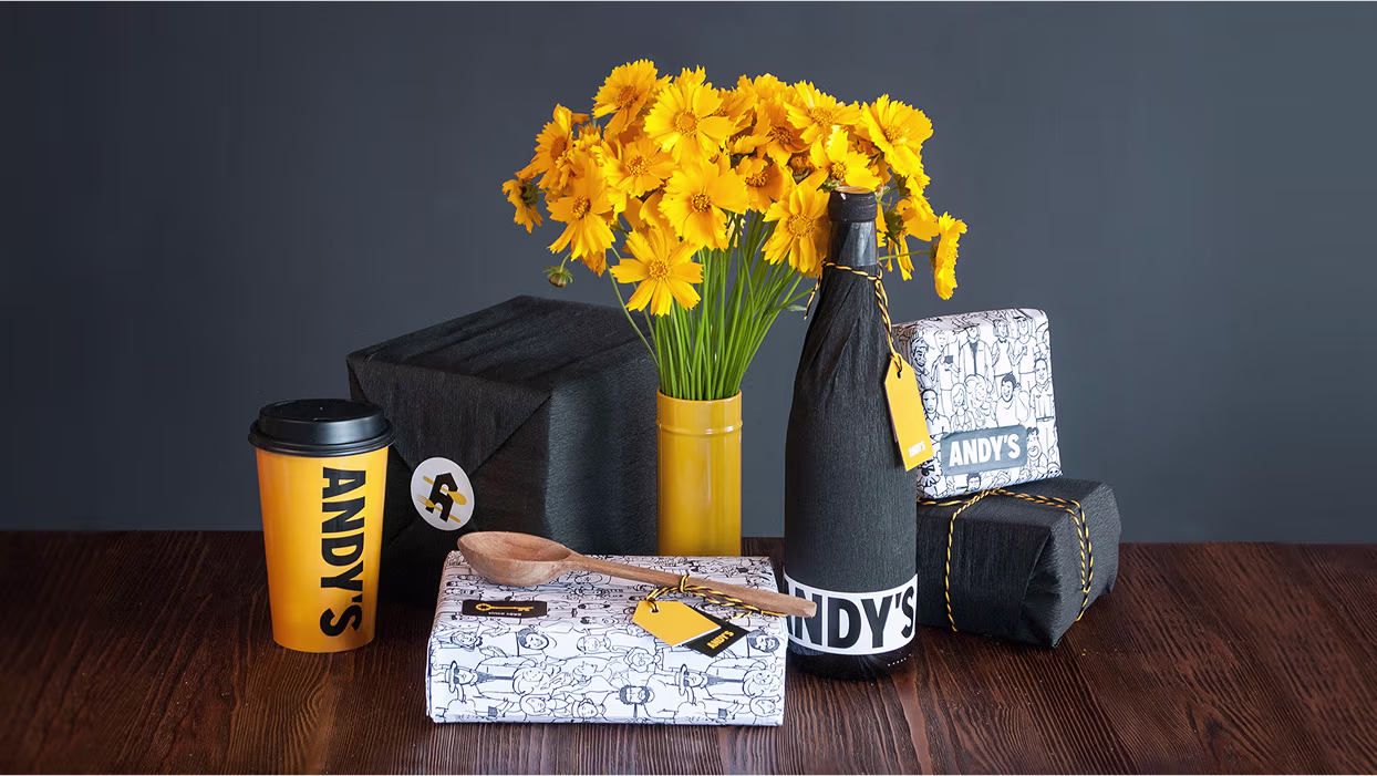
ELEMENTS, SOUVENIRS
AND TAKE-AWAY
AND TAKE-AWAY
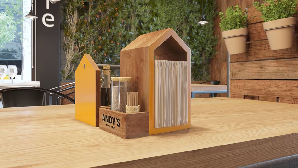
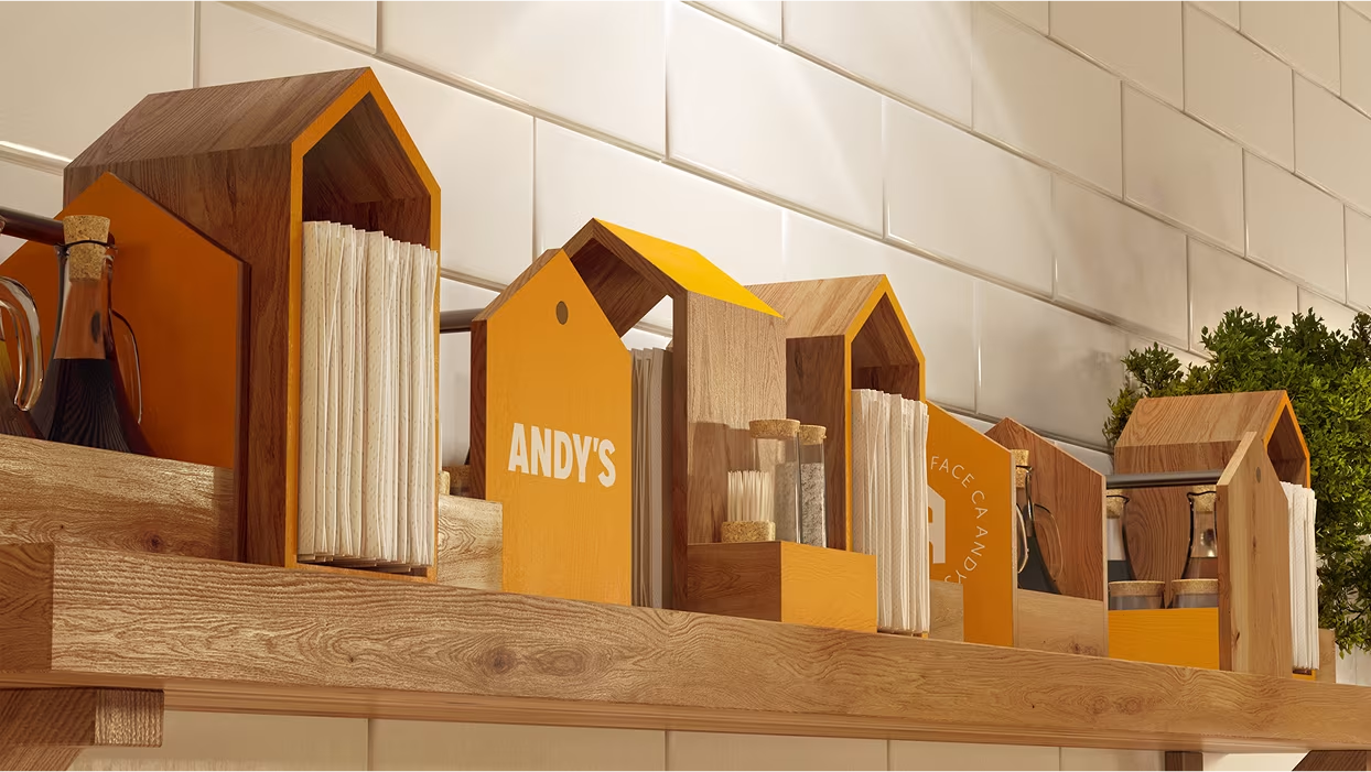
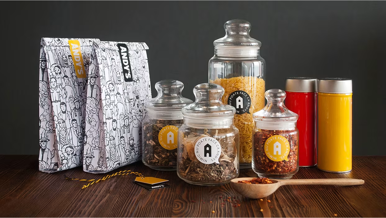
We paid attention to details in interior design trying to make them work for our concept. Table organizer and spices holder for pizza look like houses.Being stored on a shelf they form a town.
The planters are also made in a shape of a town, seen afar from a terrace.
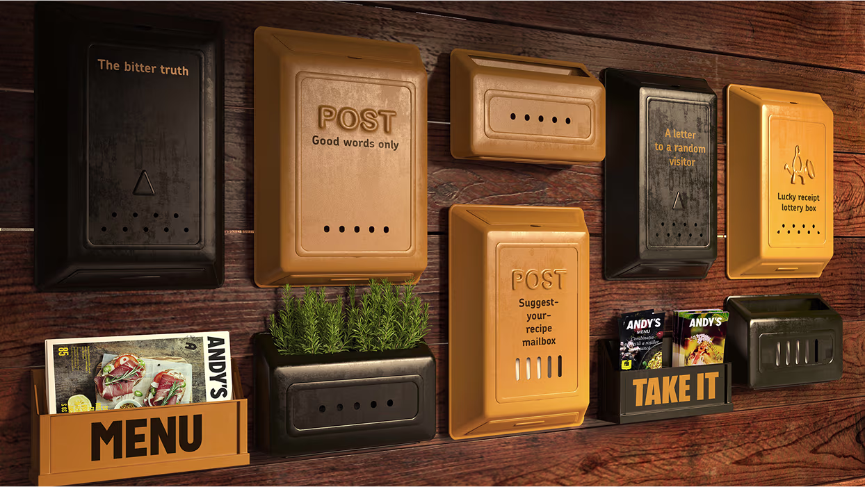
There is a special wall with mail boxes for different kinds of interplay between the customers and the restaurant service. There is a box for good comments and reviews, one for the bad feedback, “suggest-your-recipe” box, “a letter to a random visitor”, “lucky receipt lottery box” and etc. Info brochures and take-away menus are also in here.Souvenirs and take-away are packed as parcels.
We’ve made a special pattern with different people – the town dwellers. It is used on the placemats, wrapping paper, window blinds, and etc. Each placemat easily becomes a coloring sheet for kids.